Custom Components
| Capability | Free Version | Light Enjoyment Version | Professional Version | Exclusive Version |
|---|---|---|---|---|
| Custom Components | Not supported | Not supported | Supported | Supported |
Developing custom components requires certain development skills, targeting developers, ISV service providers, and senior business experts.
Function Introduction
Introduction to Custom Components
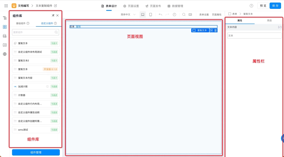
The custom component function provides customers with the ability to create components, improving the alignment between components and business requirements while reducing component development and operations costs and increasing component reusability.
Usage Scenarios
When Yida's standard components cannot meet your application development business requirements, you can develop a component that fits your business scenario according to different industry business practices or requirements. Additionally, custom components within the same organization can be shared, which provides convenience for reusing related components when developing similar applications later.
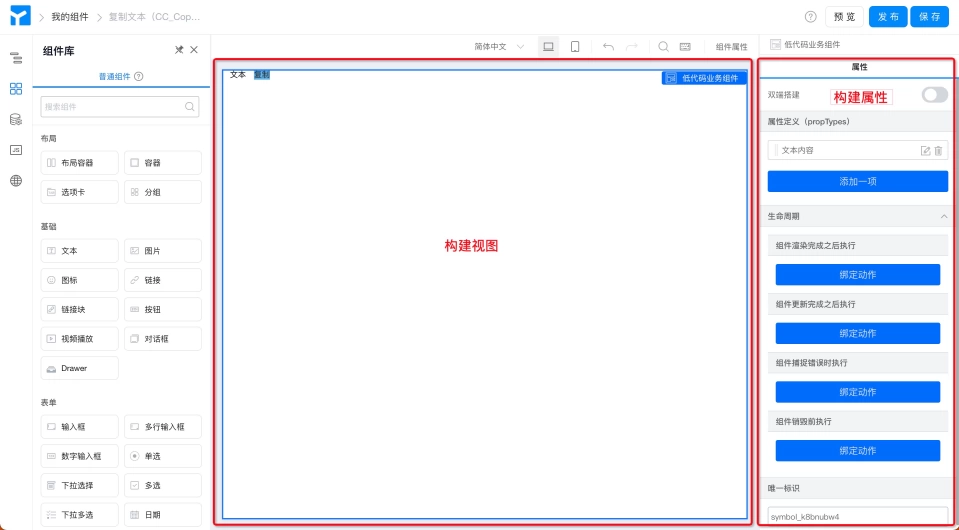
Component Structure
Components are composed of views and properties. On the consumer side, you can change the component's properties to display different views.
Views can be further divided into design views and runtime views, which can generally be reused.
On the component production side, we need to build the component's view and properties separately.
Importing Custom Component Schema
In the examples section, we provide multiple custom component examples. Developers can import the Schema from these examples into their own custom components and use them in business by following these steps:
Step 1: Create Custom Component
Developers can create a custom component for importing example Schema by following this document.
Step 2: Open Yida Schema Workbench and Import Schema
Enter the custom component designer, open the Schema workbench using this document method, and copy the custom component's Schema to the Schema workbench and click Import Schema.
Step 3: Install and Use
At this point, the custom component has been created. Next, developers can install and use the custom component by following this document.
Appendix
Component Types
Yida custom component types are divided into "Standard Components" and "Form Components" with the core differences being:
- Standard components are generally used for display functions and do not have data storage capabilities, similar to existing "Image & Text Display" and "Grouping" components.
- Form components can be used for data submission. Form components are more complex to develop than standard components and require additional metadata configuration.
- Form components are not currently available, please stay tuned.
Component Installation Types
Yida's page types include standard form pages, process form pages, report pages, DataV dashboards, custom pages, and external links. Yida's custom components currently support standard form pages, process form pages, and custom pages among these. After selecting the corresponding page type during installation, you will see the installed component in the corresponding page designer.
Component Version Information
Yida's custom component versions are divided into Development Version and Official Version. We have made additional agreements based on Semantic Versioning.
- 0.1.0 is the default development version. The development version can be synchronized in real-time with the component designer for debugging components.
- 1.x.x is the official version after release, which fixes the current version's features and ensures stability when using the component online. Therefore, please be sure to install the official 1.x.x released version for production applications.