Component Properties
Introduction
Custom components support property definition (propTypes) operations, used to enrich components at the property level. Adding custom properties not only increases customizability but also makes them more flexible and better suited to business needs, as shown below:
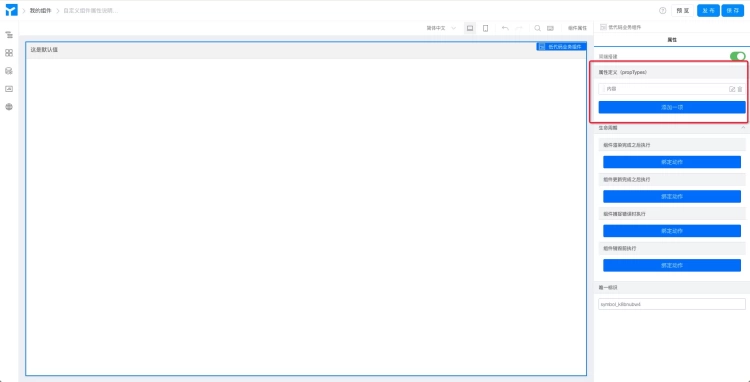
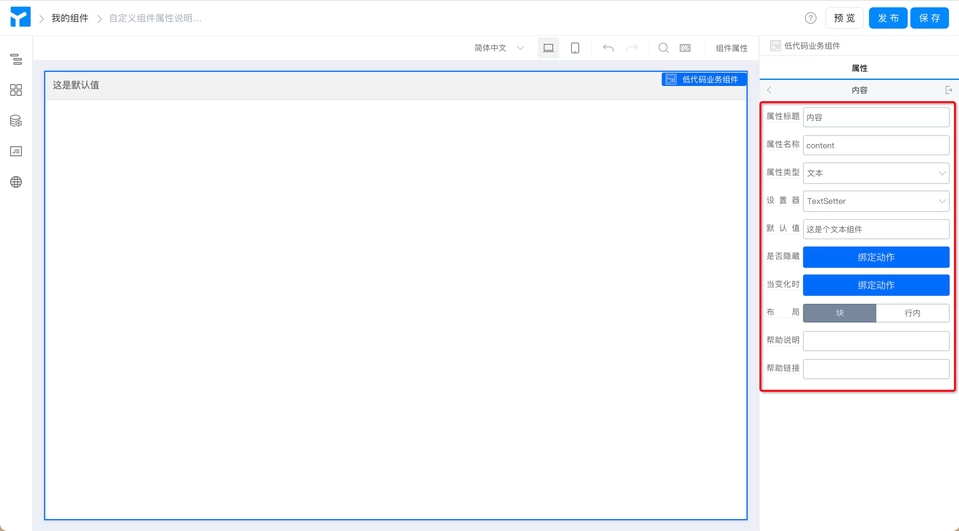
Component properties can be added through the "Add Item" button, customized through the "Edit" button, or removed through the "Delete" button. Clicking the "Edit" button shows all configuration options for component properties. (as shown below)
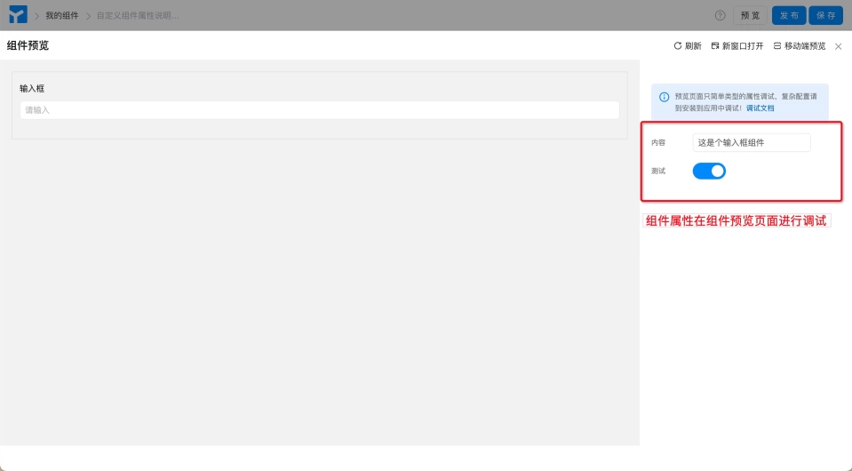
All custom component property definitions can be viewed and configured in the component preview interface (for simple property debugging) or installed in the application (for complex property configurations: including code-related debugging work). (as shown below)
For detailed descriptions of each configuration item, please see below.
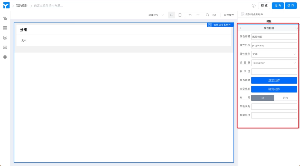
Property Title
The property name configured for the custom component. The default name for property title is "Property Title". A simple and easy-to-understand title helps users better understand the meaning of the property or identify the content to be filled.
When using this component in a page, it appears as follows:
Property Name
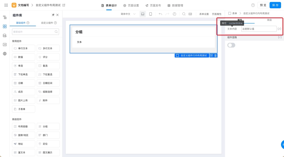
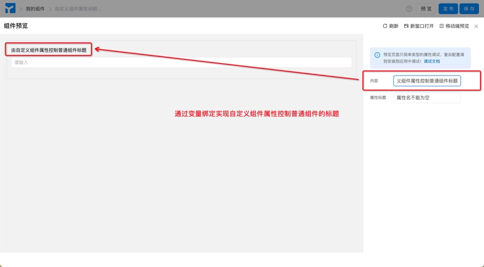
The component's property name is the property Key of the component, similar to props.xxx in a group. The default value is propName. It can be bound to variables in page design to achieve control over the component. For example, the property value of a custom component serves as the title of a certain component within the custom component. (as shown below)
Note: Component property names cannot be empty, otherwise errors will occur during calls or assignment operations.
Property Type
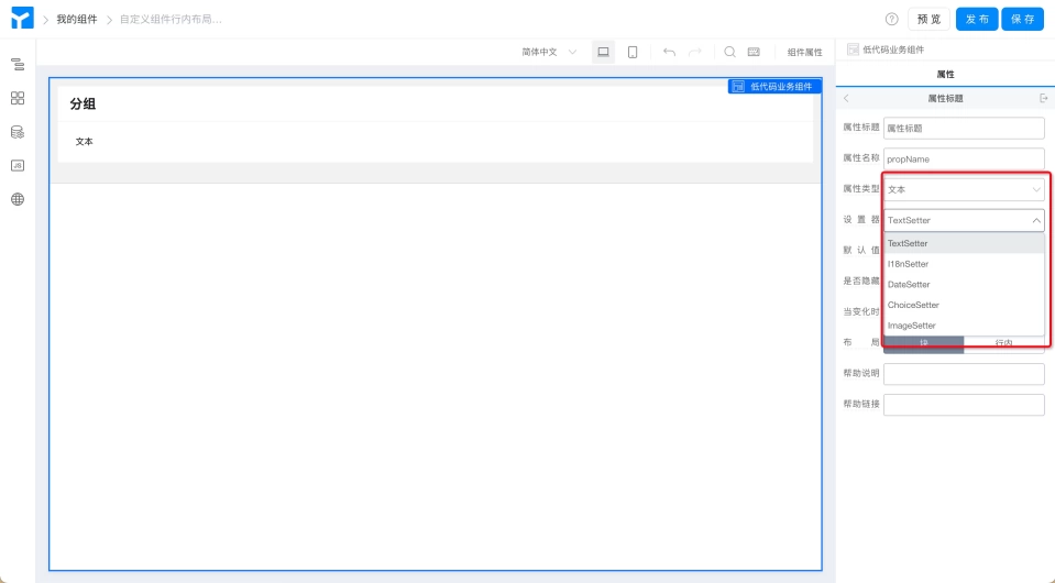
Component property types are basically similar to common data types, with seven types: Text, Boolean, Number, Object, Array, Function, Element. Each data type corresponds to several Setters to meet users' different dimensional data processing needs. (as shown below)

Setter
Components with different property types have different property setters, achieving different component rendering and data processing methods. For example, the text type corresponds to five setters. (as shown below)
Default Value
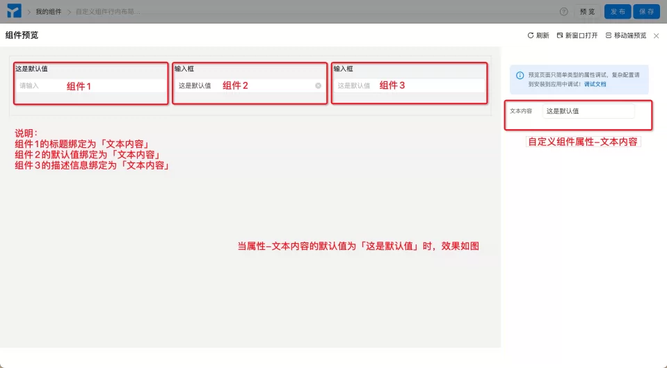
It refers to the field that the custom component in the form displays by default when the user visits the form. (Effect as shown below)
Whether to Support Variable Binding
Variable binding in page design.
Whether to Hide
Controls whether this property is hidden. Generally not needed.
When Changed
Can be used for linkage between multiple properties. Generally not needed.
Layout
Divided into Block (block) and Inline (inline), used to set the arrangement method of this custom component within the page.