Quick Start
This document demonstrates custom component development, debugging, installation, and usage through a small case study of implementing text copy functionality with a custom component.
Case Scenario
Using the custom component feature, perform low-code transformation on Yida's existing text component to implement text copy functionality. This is used to copy text content to the clipboard, making it easier for users to fill in duplicate fields.
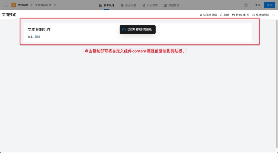
Implementation Effect
Steps
Step 1: Create Custom Component
By configuring component properties such as name, type, and identifier, you can cost-effectively customize a component that better fits business needs.
Steps:
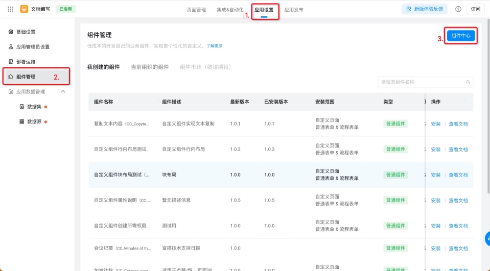
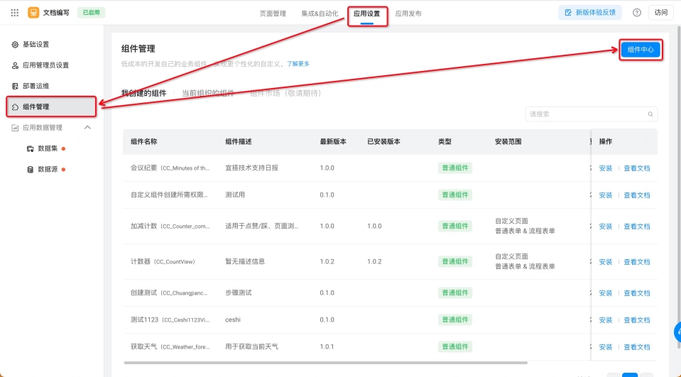
- Yida Application >> Application Settings >> Component Management >> Component Center (as shown below)
- Add Component >> Fill in component name, component type, component identifier and other component properties >> Confirm (as shown below)

Step 2: Develop and Debug Custom Component
Develop and debug the component to meet different business needs. In this case, implement the component's counting functionality.
Steps:
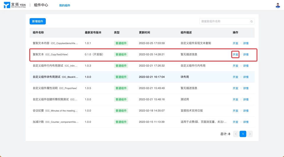
- Component Center >> My Components >> Find the component to debug >> Develop (as shown below)
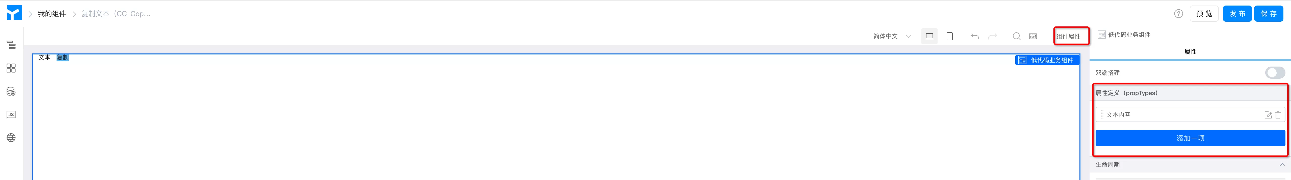
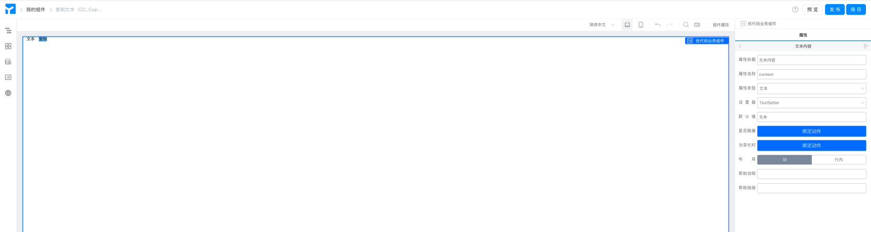
- As mentioned earlier, components consist of views and properties. When developing a component, you first need to abstract the properties needed for the component. Let's start by building the component's properties. This component only needs a text content property. Property Configuration >> Property Definition, add a text content property named content, select Text as property type, and select textSetter as setter.
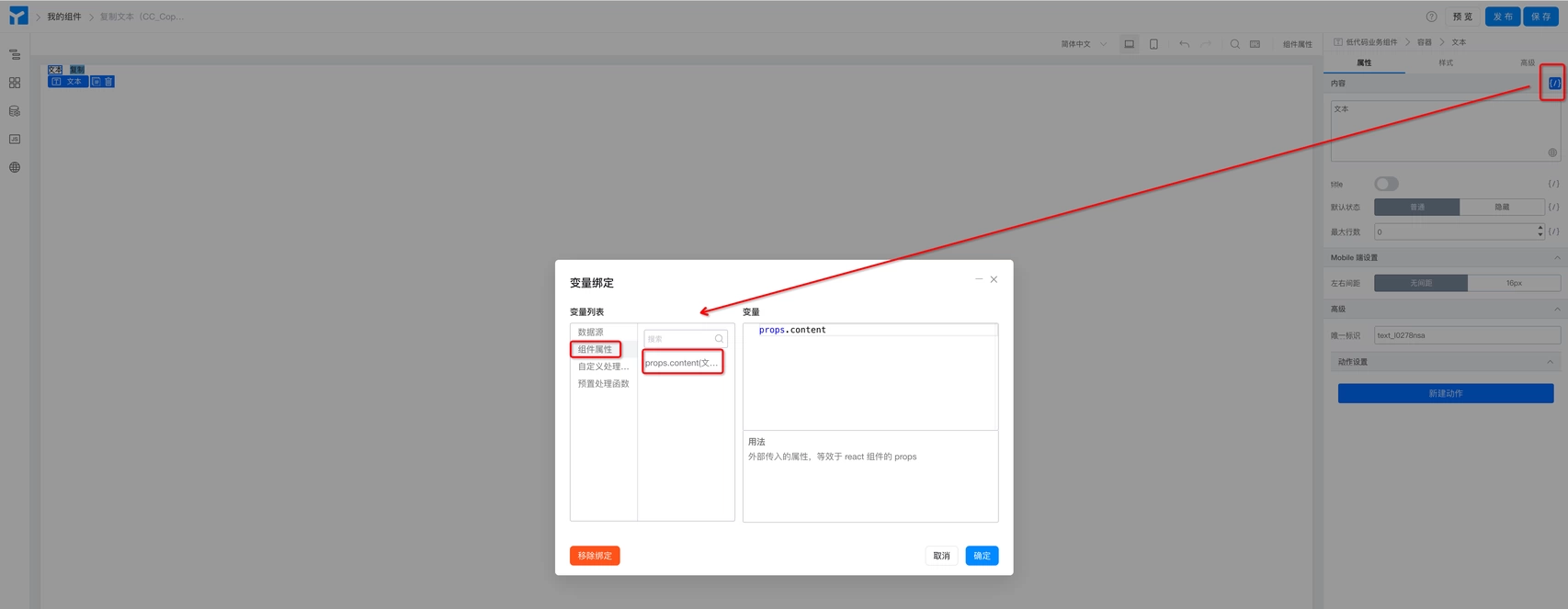
- After building the component properties, let's build the component view. Add the required Yida Standard Components to the canvas (in this case, the required components are two text components, named "Text" and "Copy" respectively), and configure basic properties. Bind the content of the text component to the property we just created, props.content, so that it can display the passed property value at runtime. (as shown below)
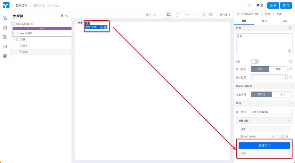
- Set up actions for the button component to implement the text copy effect. Select the "Copy" text >> New Action >> onCopyText Click. (as shown below)
- Write the copy logic in the JS panel. (as shown below)
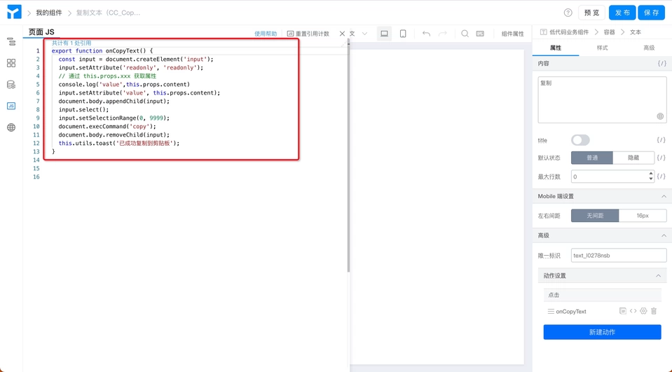
export function onCopyText() {
  const input = document.createElement('input');
  input.setAttribute('readonly', 'readonly');
  // Get property via this.props.xxx
  input.setAttribute('value', this.props.content);
  document.body.appendChild(input);
  input.select();
  input.setSelectionRange(0, 9999);
  document.execCommand('copy');
  document.body.removeChild(input);
  this.utils.toast('Successfully copied to clipboard');
}
- Save >> Preview Component

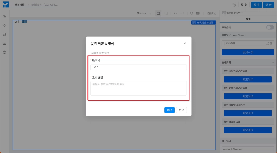
- Publish >> Fill in version number and related descriptions for component publication >> Confirm. (as shown below)
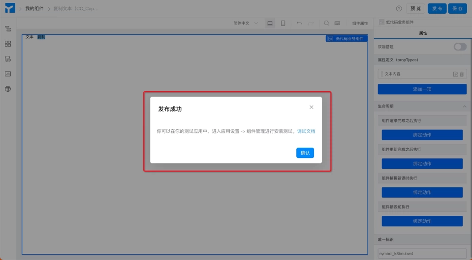
- After successful publication, you will see a notification. (as shown below) In actual component development, you can install the development version (0.1.0) of the component after saving for real-time debugging. Only when the component development is completed do you need to publish an official version.
Step 3: Install Custom Component
Install the developed and debugged custom component into the page so that it can be used during page design. Component installation requires selecting a page type, and after selection, the corresponding custom component will appear in the corresponding page designer.
Steps:
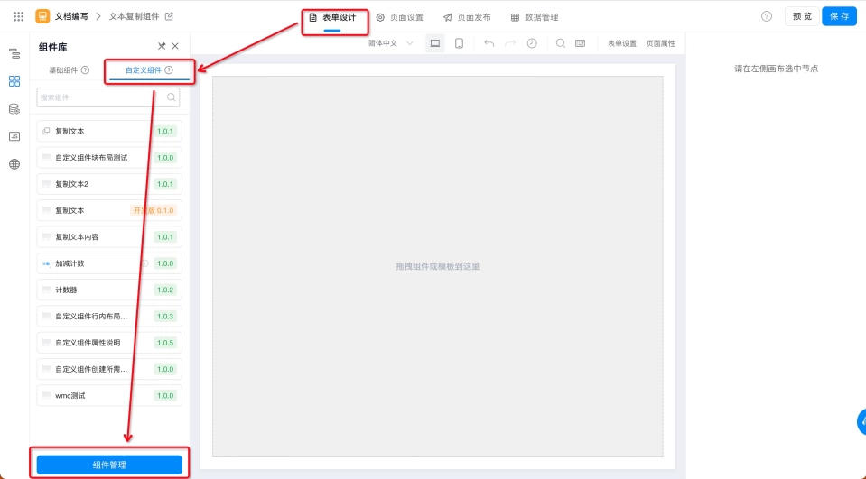
- Form Design Page >> Component Library >> Custom Components >> Component Management. (as shown below)
- Component Management Page >> Component List >> Select the custom component to install >> Install. (as shown below)
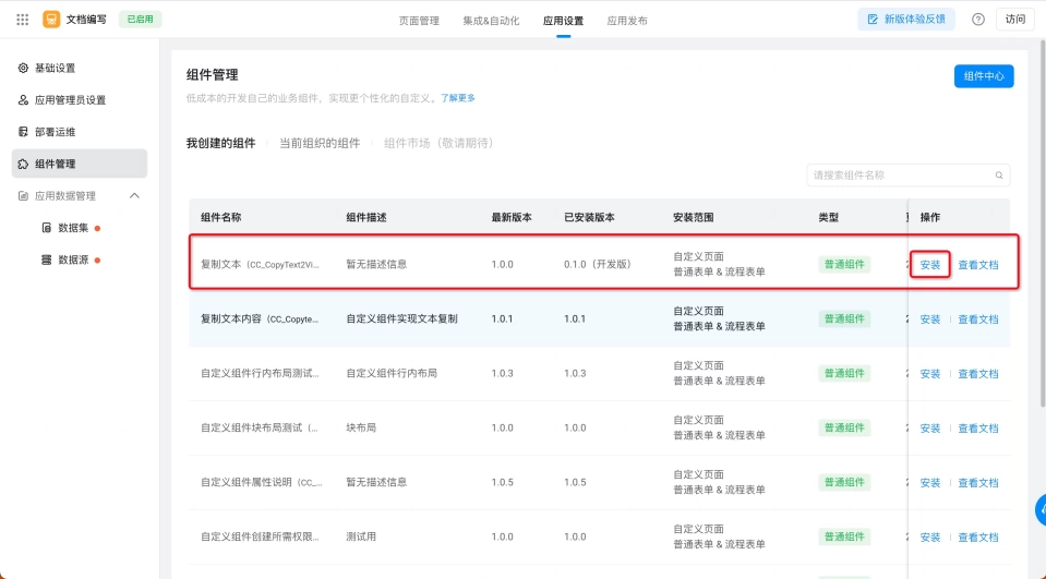
- Select Installation Version and Installation Scope >> Install. (as shown below)
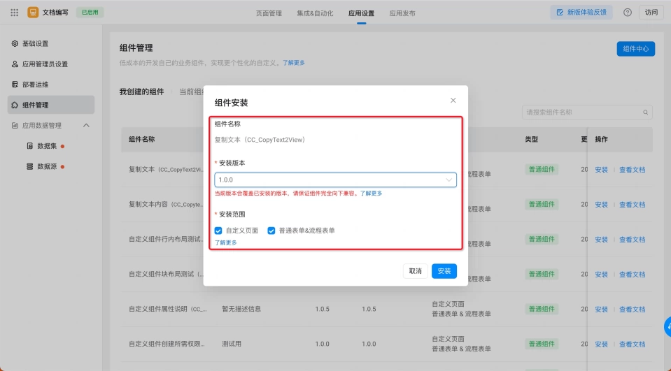
- To ensure stability when using custom components online, when selecting component versions, please make sure to install the official version after 1.x.x is published.
- To ensure custom components can be used in the page designer, when selecting installation scope, you will only see the installed component in the corresponding page designer after selecting the corresponding page type.
Step 4: Use Custom Component
Through the above steps, the custom component has been installed in the custom components category of the page component library. You can use it through the following steps.
Steps:
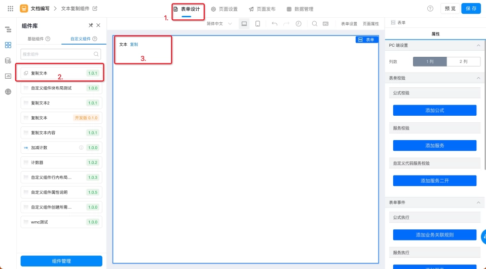
- Form Design Page >> Component Library >> Custom Components >> Select the required component >> Drag and drop to canvas. (as shown below)
Step 5: View/Edit Component Information
During component usage, if you need to modify the component thumbnail, component documentation URL, or component description, you can operate through the following path.
Steps
- Application Settings >> Component Management >> Component Center (as shown below)
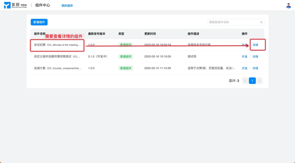
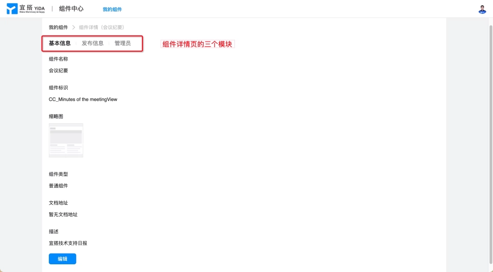
- Select the component for which you want to view/edit details >> Details (as shown below)
Note: The component details page is divided into three modules: Basic Information, Release Information, and Administrators (as shown below), where:
- Basic Information: Click "Edit" to modify the custom component's thumbnail, help documentation URL, and component description. Other configurations are set when the component is created and cannot be modified.
- Release Information: You can view the iteration records of the custom component, including component versions and corresponding release notes.
- Administrators (those with development and debugging permissions for custom components, default is the component creator): You can add or remove administrators for permission management.
Custom Component Properties
Custom components not only support low-code transformation of existing Yida components, but also support custom operations on the properties (propTypes) of the generated custom components. This makes custom components more suitable for developers' daily work scenarios, conform to developers' daily work habits, and provides higher flexibility and customizability for custom components.
Custom Component Property Configuration Entry
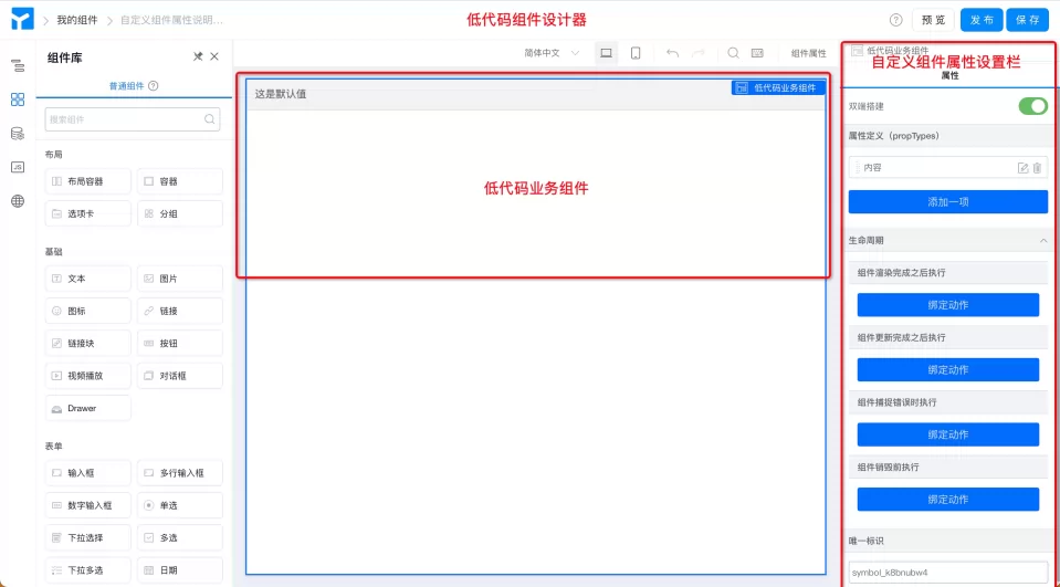
Path: Low-code Component Designer >> Select "Low-code Business Component" on canvas >> Right side properties (as shown below)
Custom Component Property Configuration Description
Custom component properties are divided into four modules: Dual-end Construction, Property Definition ( propTypes), Lifecycle, and Unique Identifier. Among them,
- Dual-end Construction: Dual-end construction is a configuration switch. When enabled, PC and mobile ends can be completely separated and designed separately to meet personalized business needs for dual-end adaptation.
- Property Definition ( propTypes ): You can customize basic properties such as title, name, type (data format), default value for custom components, and also bind events for whether the component is hidden (component hide/show status) and when changed (different component display values) to meet various business needs. For detailed introduction, see Component Property Configuration.
- Lifecycle: The lifecycle of custom components is divided into four stages: Component Render Complete (
componentDidMount), Component Update Complete (componentDidUpdate), Component Error Catch (componentDidCatch), and Component Destroy Before (componentWillUnmount). Different logical code is written in different lifecycles to meet complex business needs. - Unique Identifier: Like standard Yida components, custom components also have a unique identifier property that serves as the unique identification code of the component, automatically generated by the system and generally does not need to be changed. Used for Yida backend data storage, code binding, etc.
Special Note:
- The Unique Identifier (fieldId) is the unique identification code that Yida uses to point to this component. Changing the identifier may affect formulas used on this component, data storage (data may also be lost), and code references on the JS function side. We strongly do not recommend modifying the component's unique identifier property!
- If you insist on modifying this identifier (currently only through the schema import method), if you choose to use this method to modify the component unique identifier, it means you have clearly understood the consequences of doing so and are willing to take full responsibility. Yida reserves the right not to be held liable for any consequences. Thank you for your understanding and support.