
Custom page implementation
1. Usage scenarios
This example describes how to use the CSS3 YIDA style attribute on the animation custom page to achieve the effect of the PC-side and Mobile-side racecourse.
2. Implement functions
2.1. Pattern 1
2.1.1. Create a custom page
2.1.2. Configure page effects
2.1.2.1. Parent container configuration
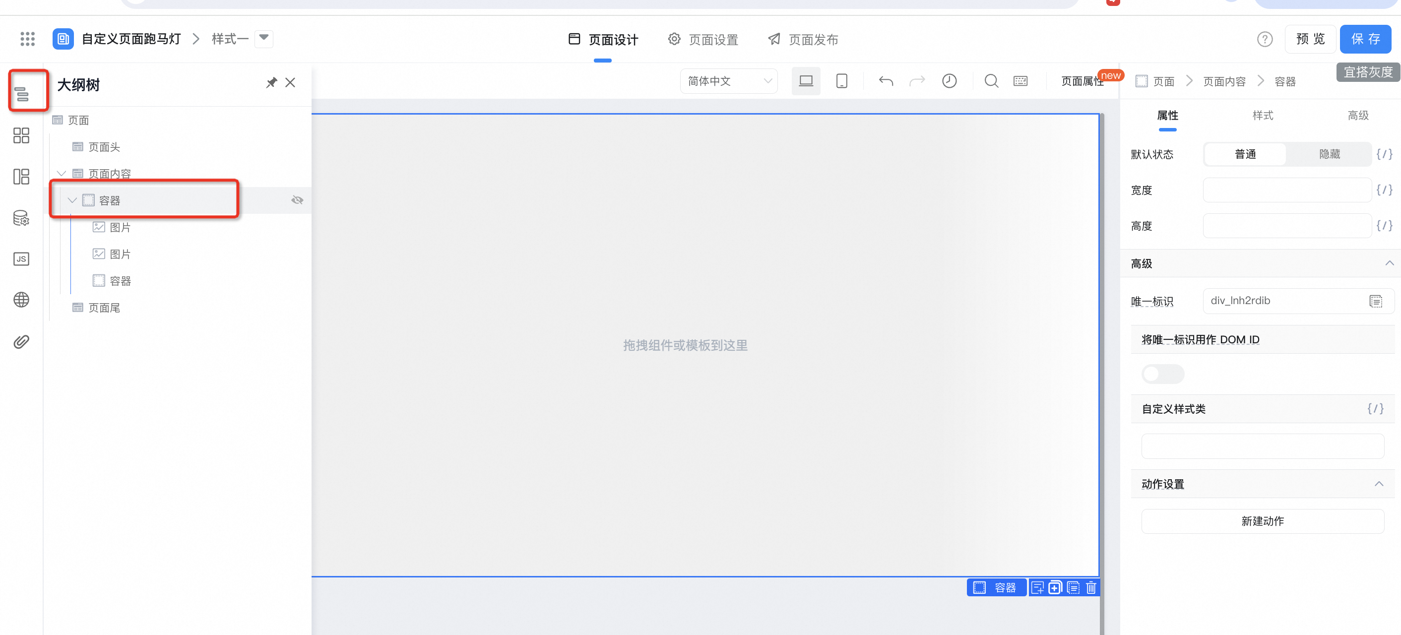
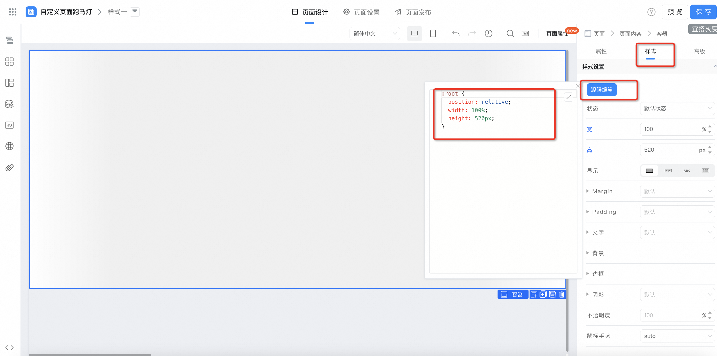
Container style configuration:
:root {
  position: relative;
  width: 100%;
  height: 520px;
}
2.1.2.2. Start bit image container configuration
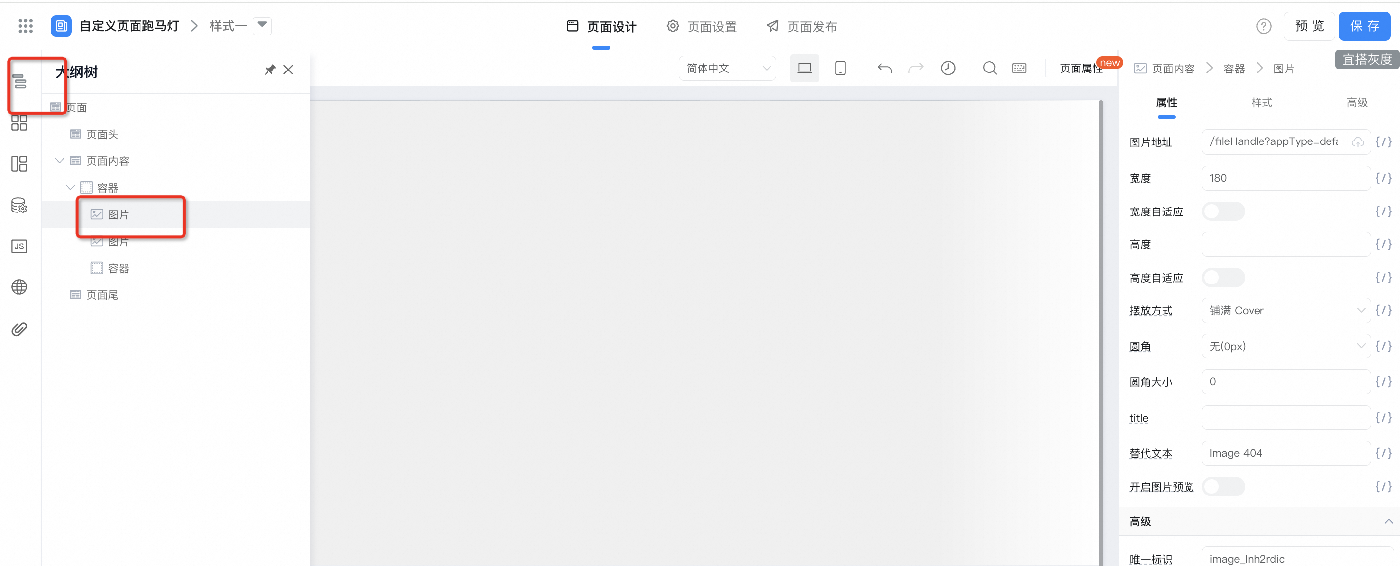
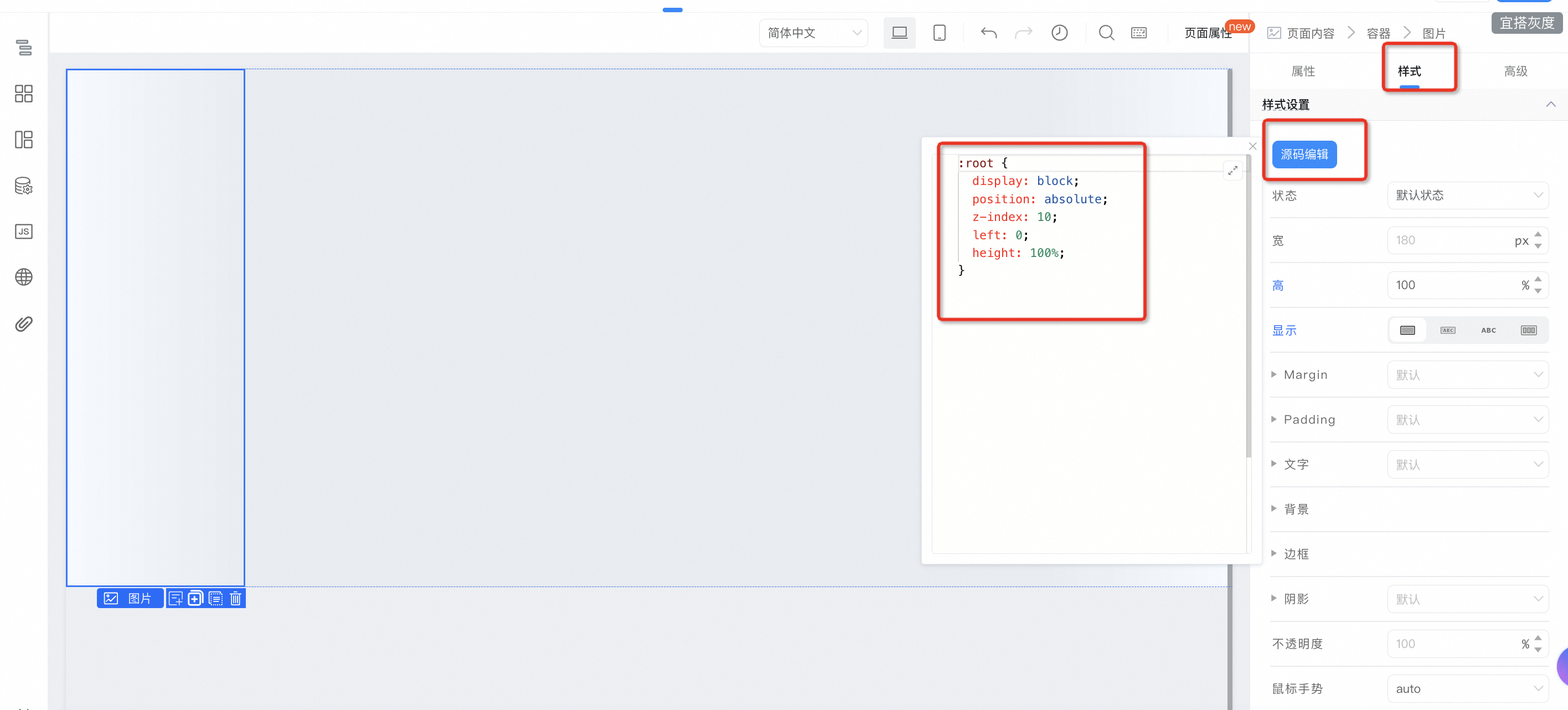
:root {
  display: block;
  position: absolute;
  z-index: 10;
  left: 0;
  height: 100%;
}
2.1.2.3. End image container configuration
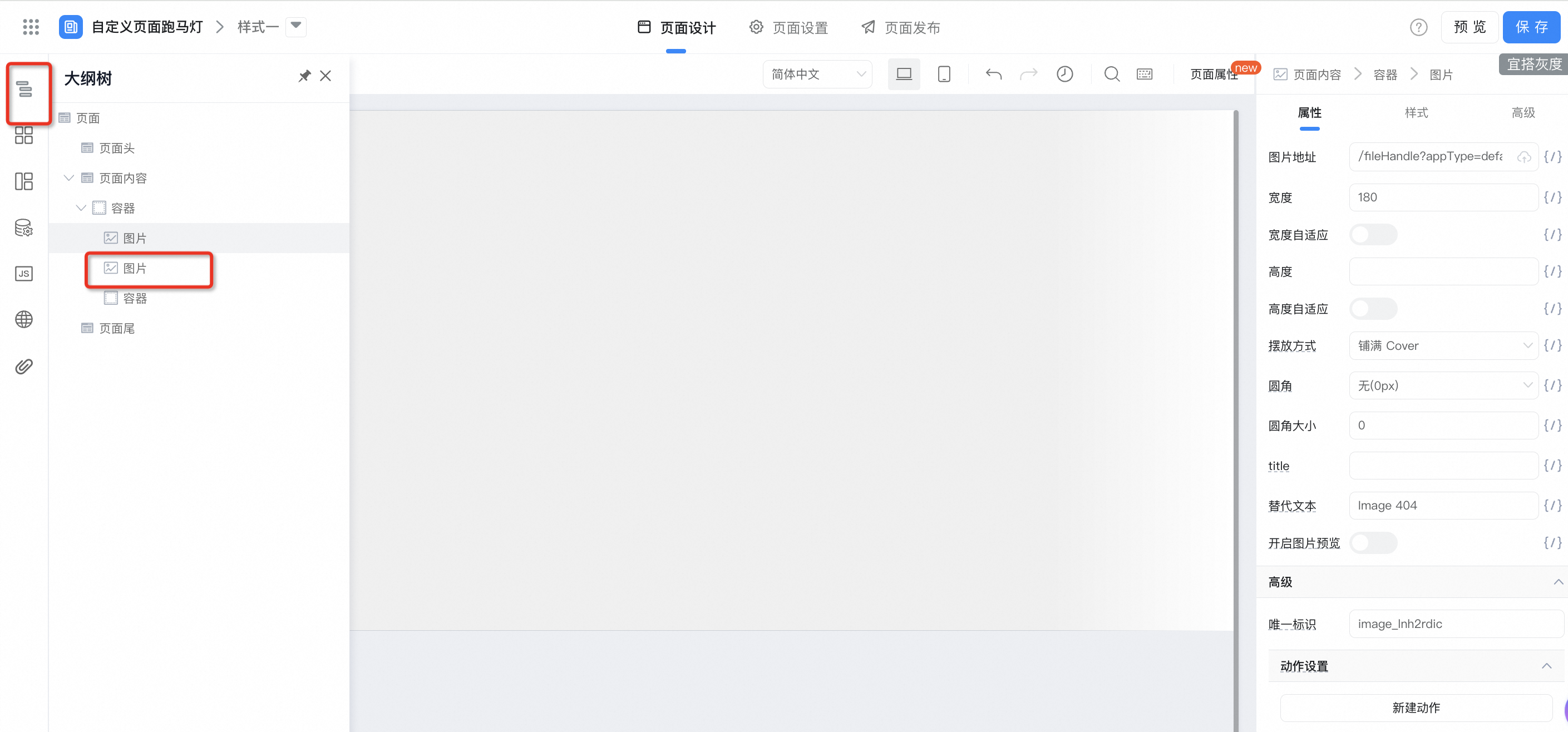
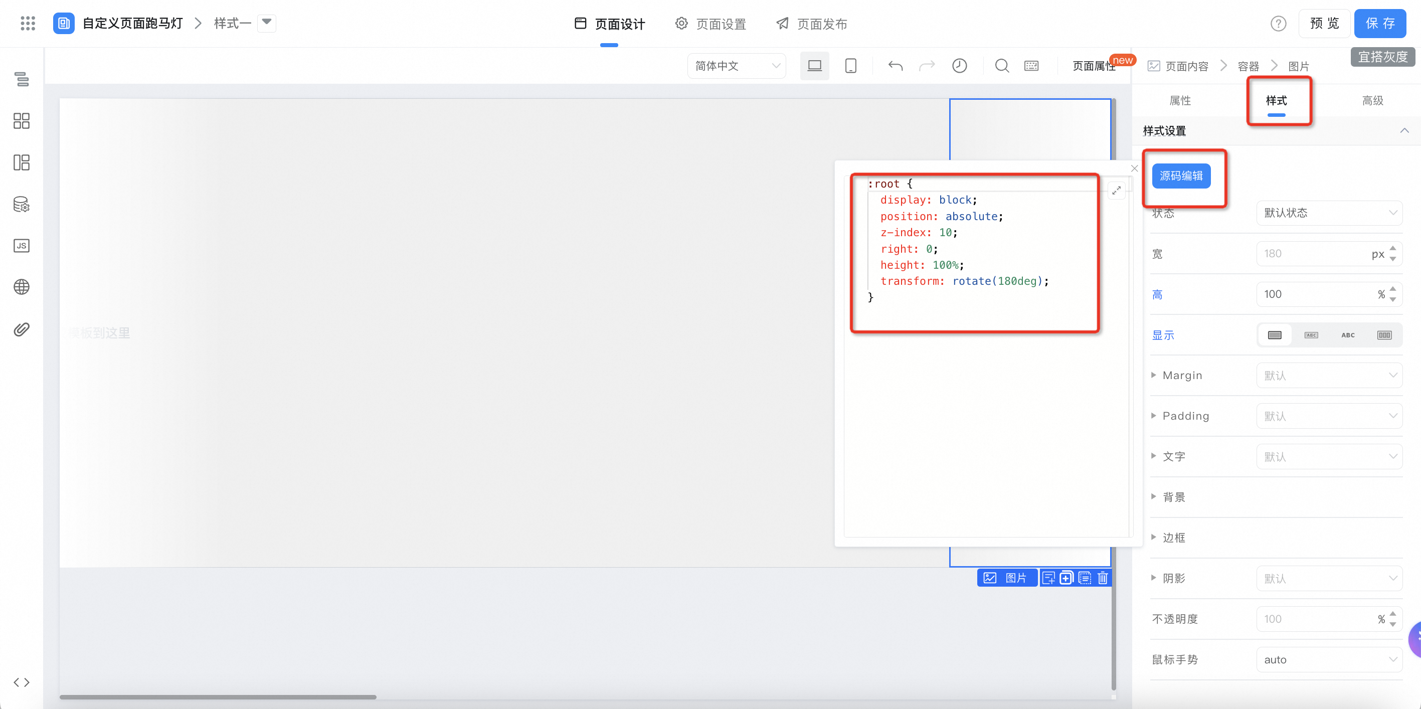
:root {
  display: block;
  position: absolute;
  z-index: 10;
  right: 0;
  height: 100%;
  transform: rotate(180deg);
}
2.1.2.4. Revolving scenic lantern container configuration
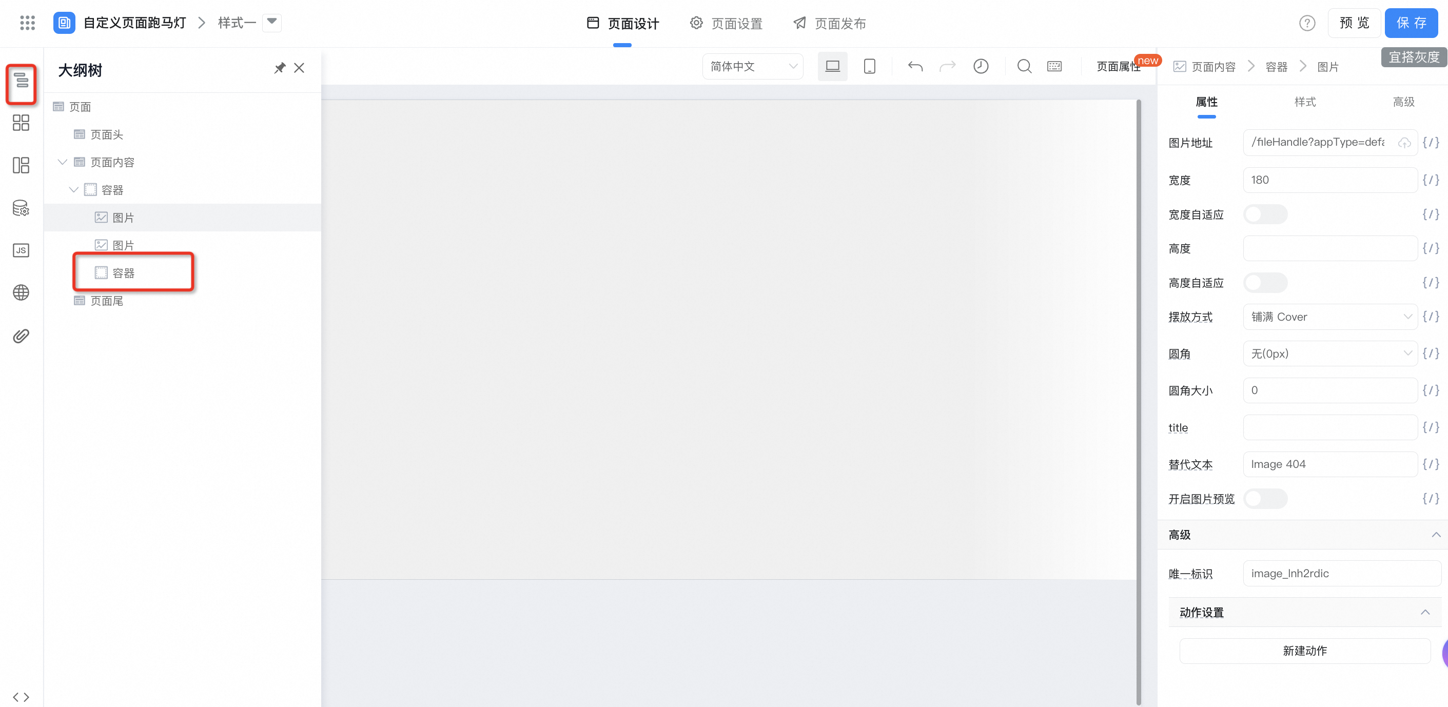
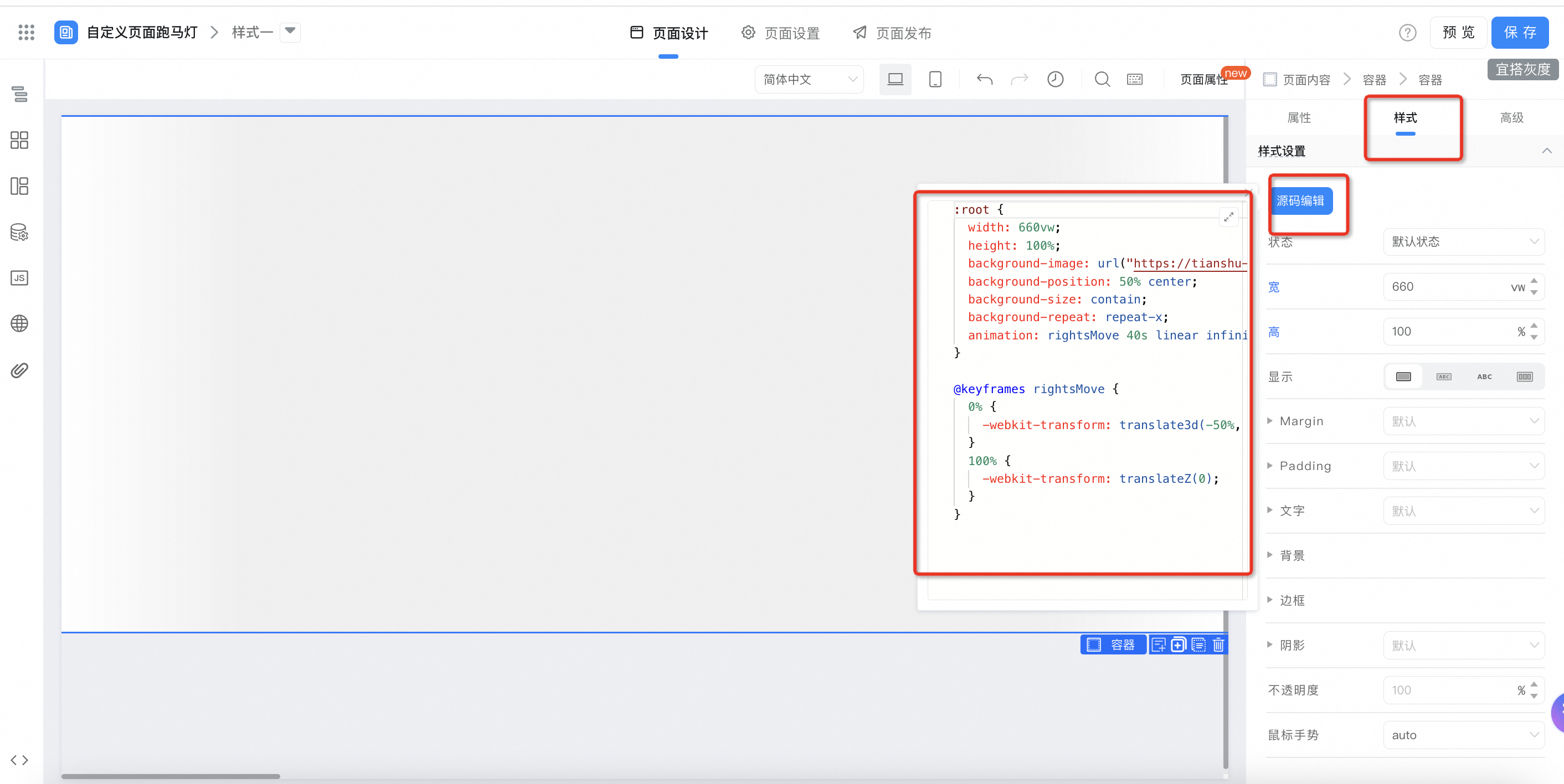
:root {
  width: 660vw;
  height: 100%;
  background-image: url("您的走马灯图片地址");
  background-position: 50% center;
  background-size: contain;
  background-repeat: repeat-x;
  animation: rightsMove 40s linear infinite;
}

@keyframes rightsMove {
  0% {
    -webkit-transform: translate3d(-50%, 0, 0);
  }
  100% {
    -webkit-transform: translateZ(0);
  }
}
2.2. Style two
2.2.1. Create a custom page
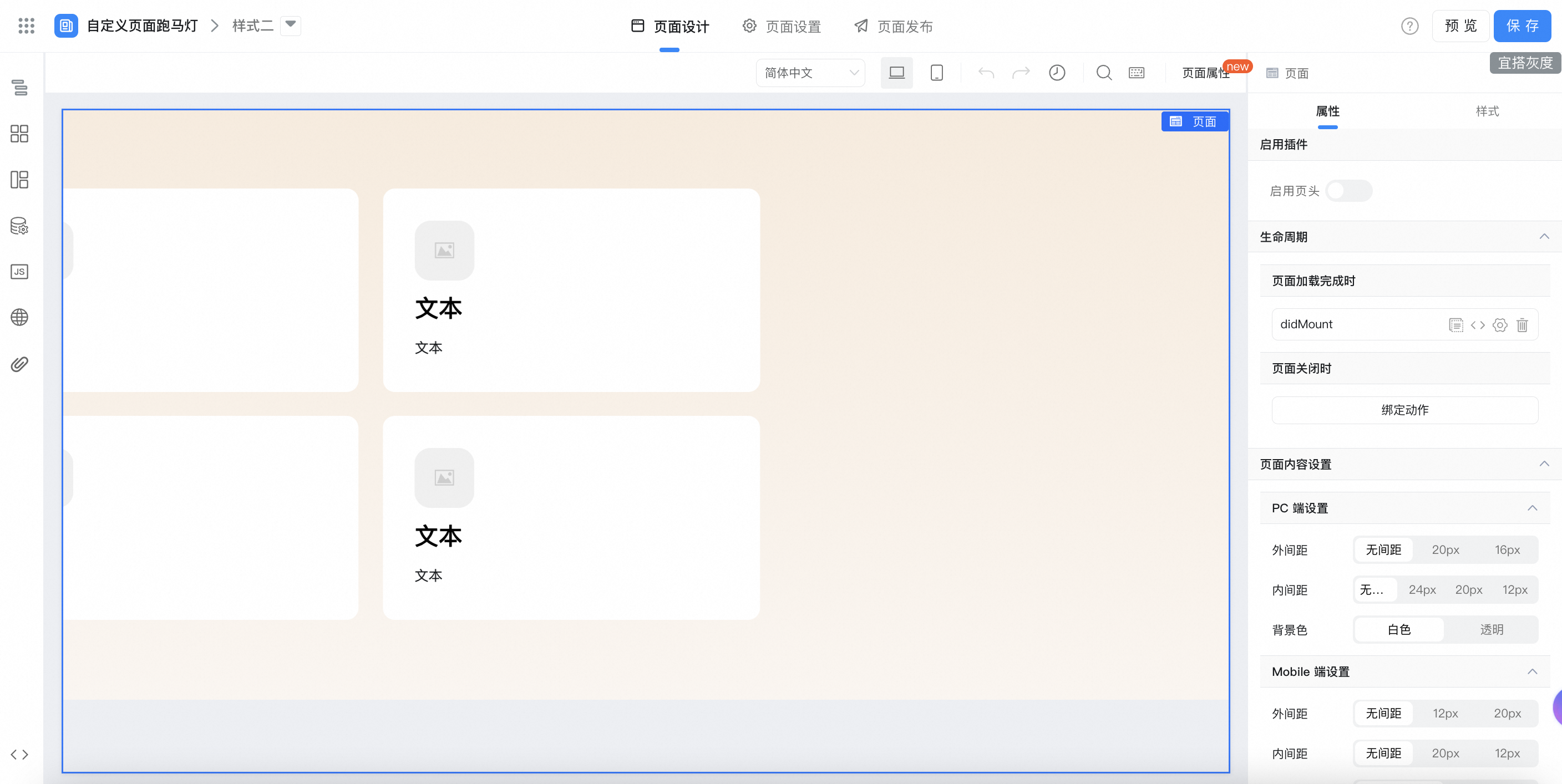
2.2.2. Configure page effects
2.2.2.1. Configure variables
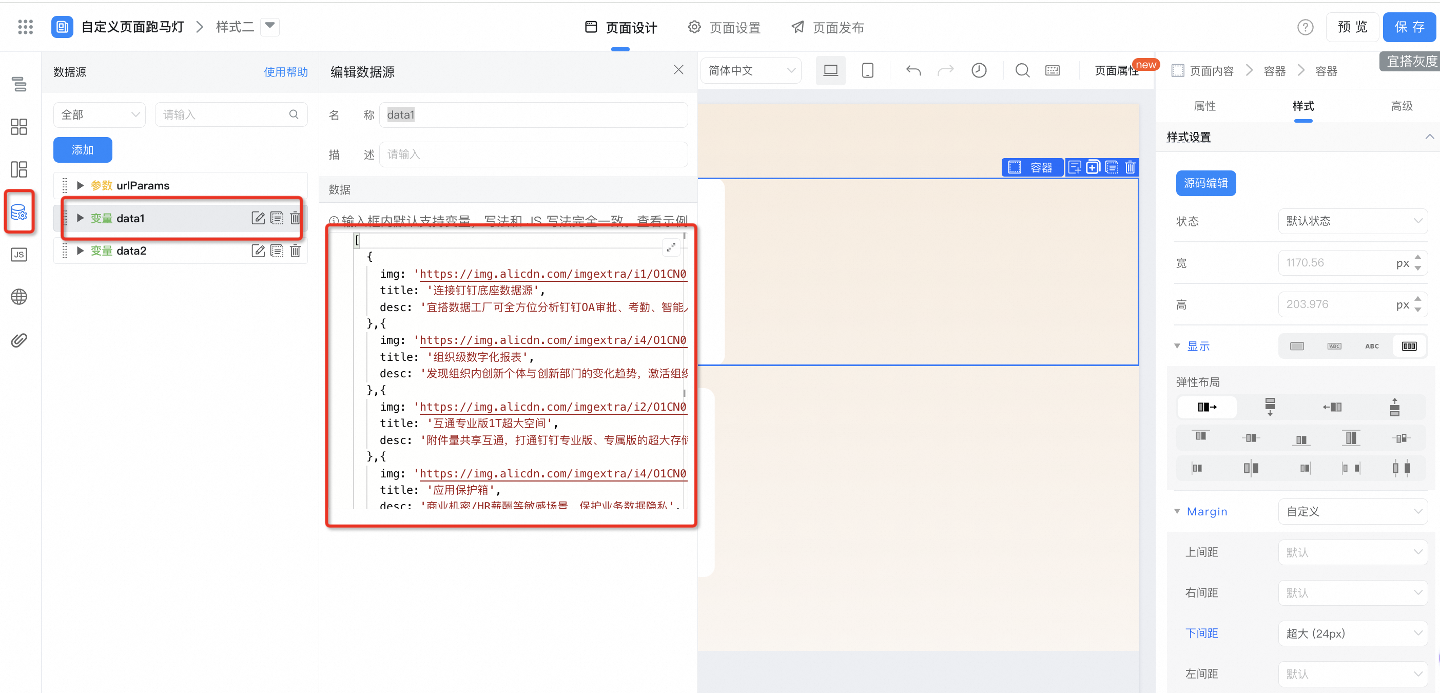
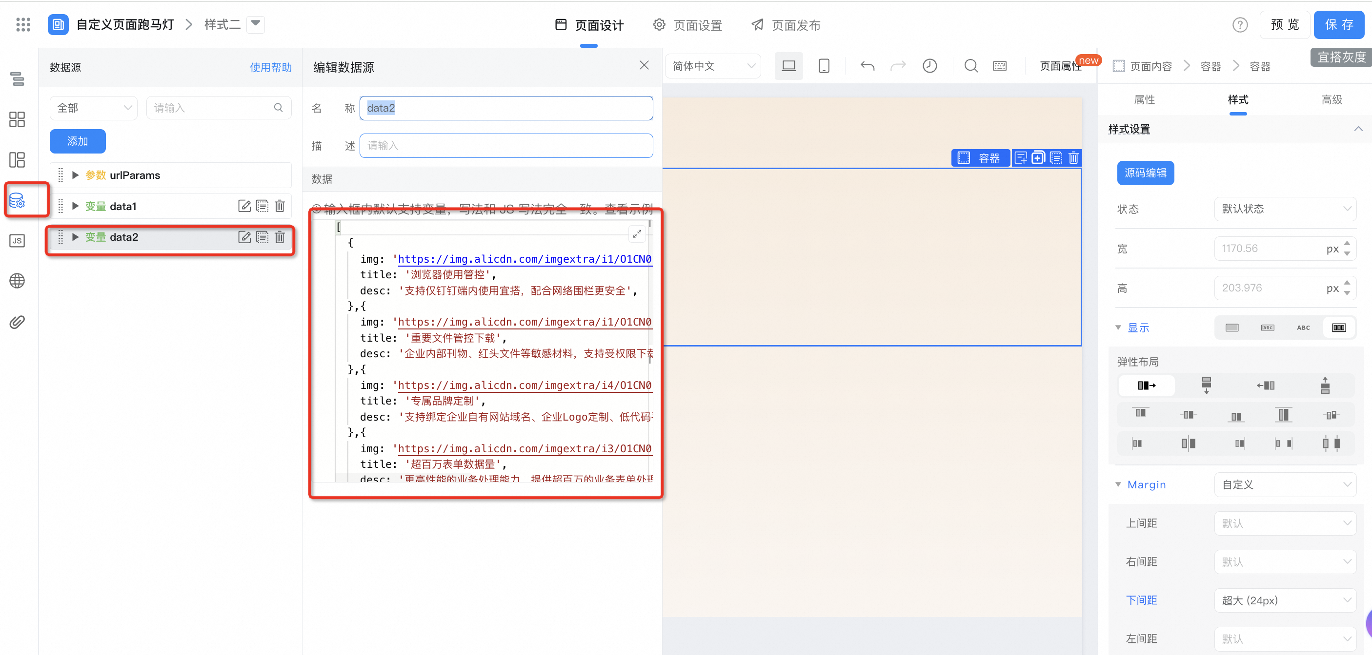
2.2.2.2. Parent container configuration
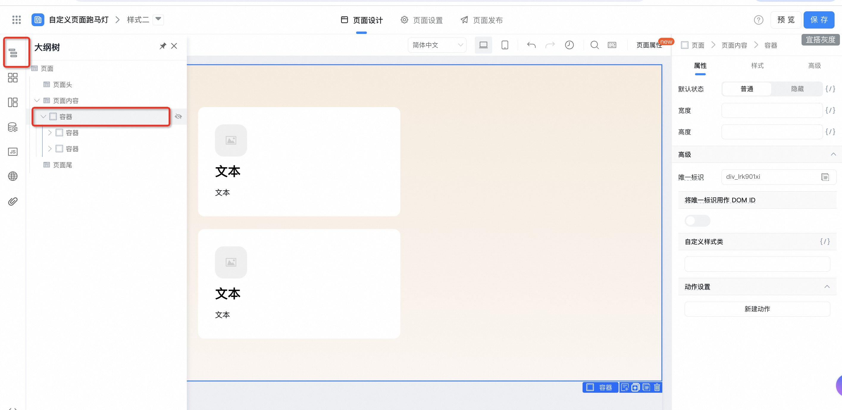
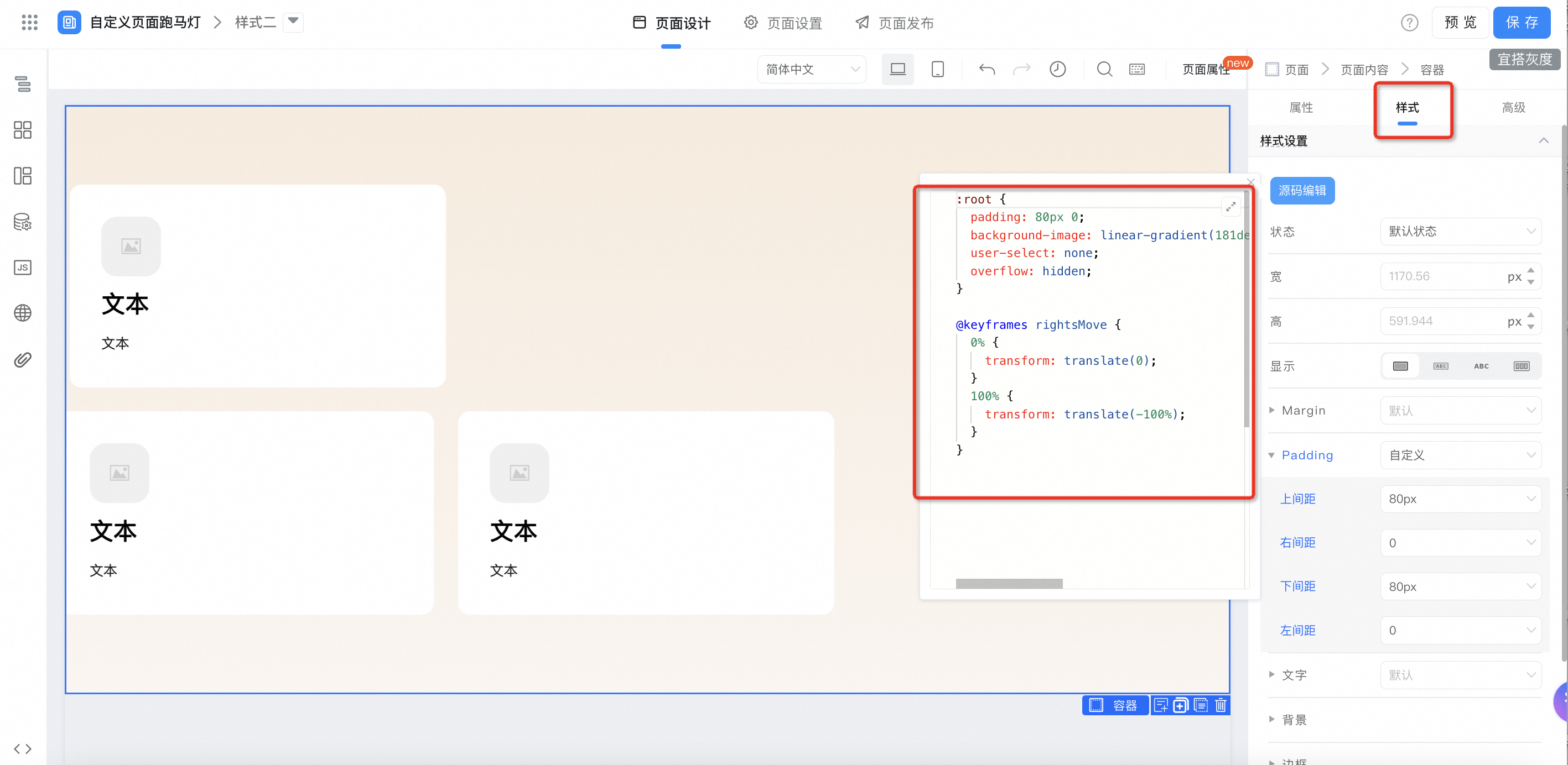
:root {
  padding: 80px 0;
  background-image: linear-gradient(181deg, rgba(228,175,117,0.25) 0%, rgba(216,162,114,0.10) 100%);
  user-select: none;
  overflow: hidden;
}

@keyframes rightsMove {
  0% {
    transform: translate(0);
  }
  100% {
    transform: translate(-100%);
  }
}
2.2.2.3. Row container configuration
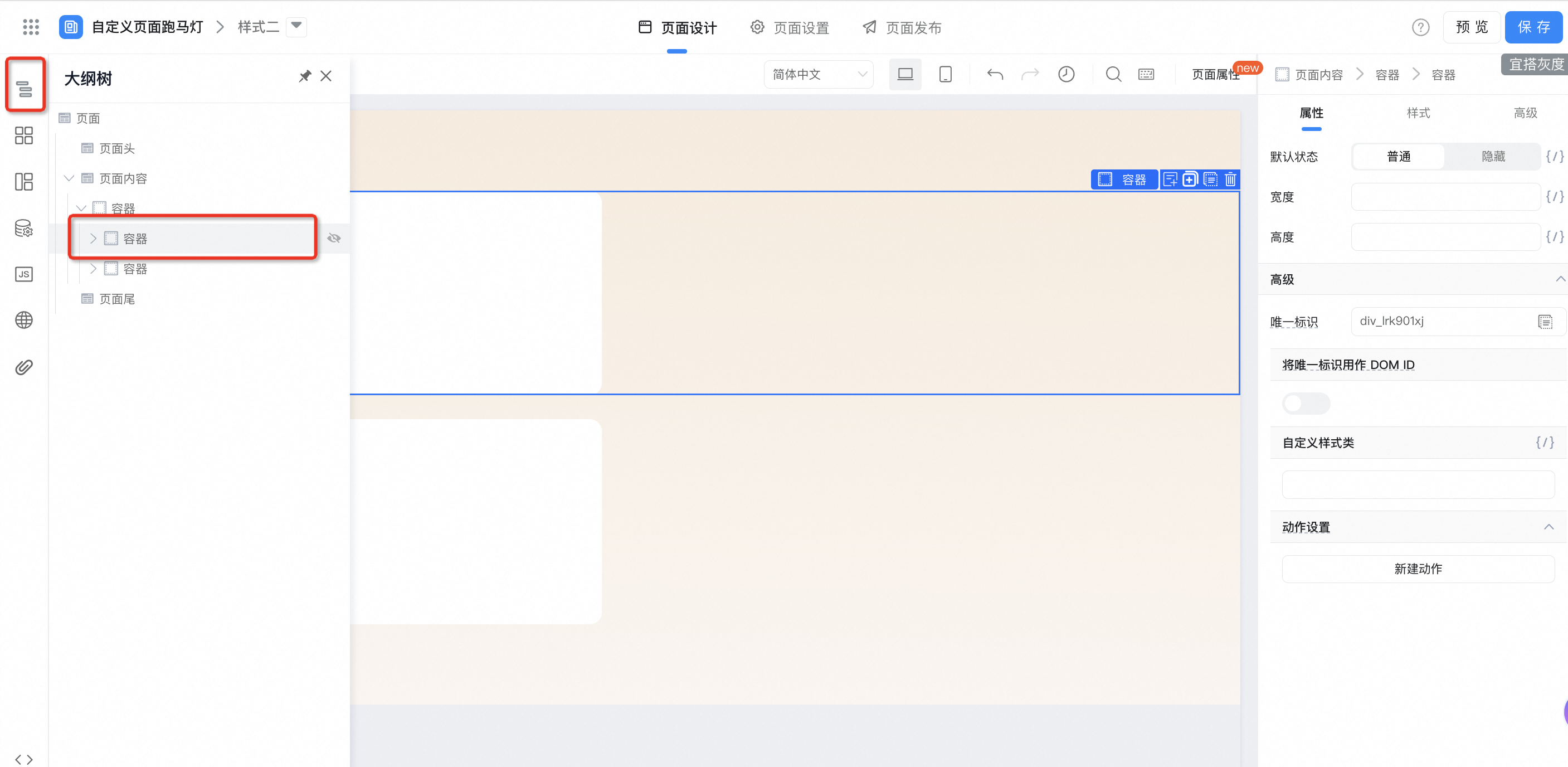
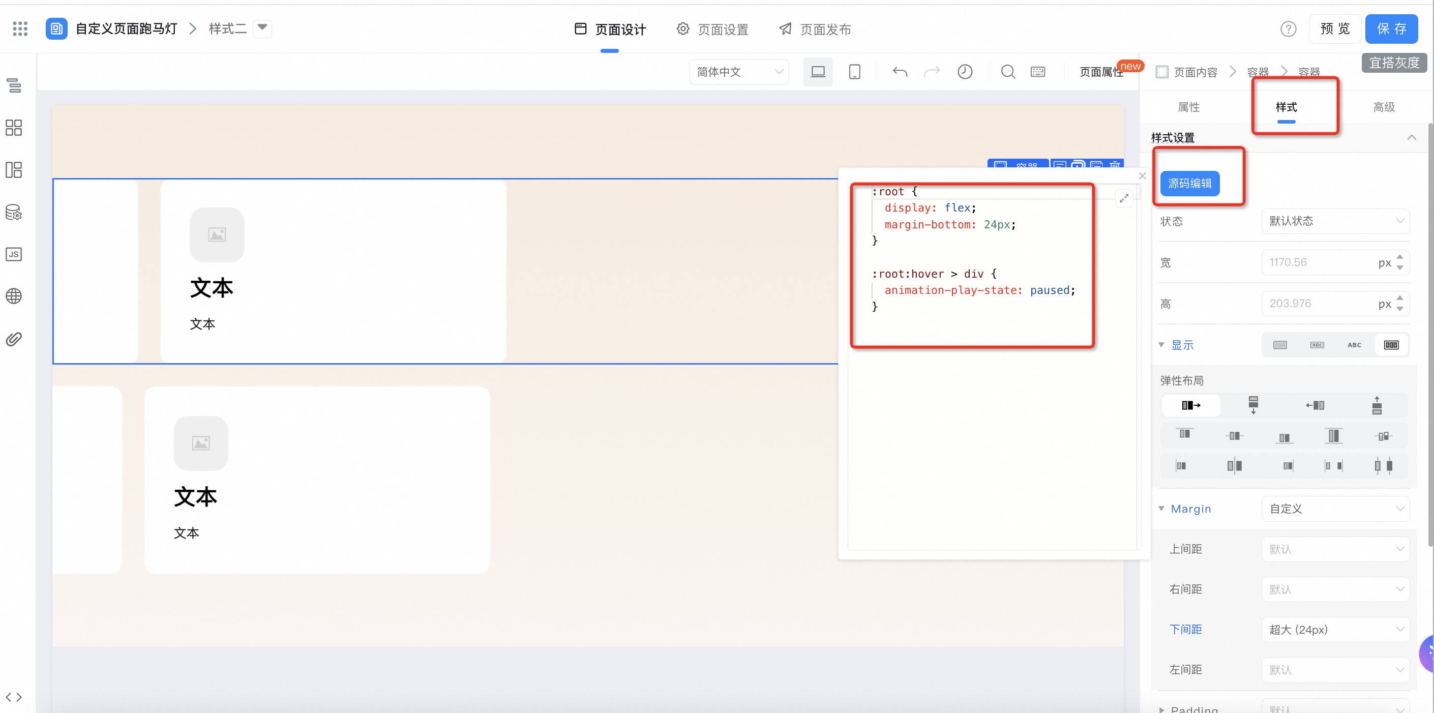
:root {
  display: flex;
  margin-bottom: 24px;
}

:root:hover > div {
  animation-play-state: paused;
}
2.2.2.4. Block container configuration
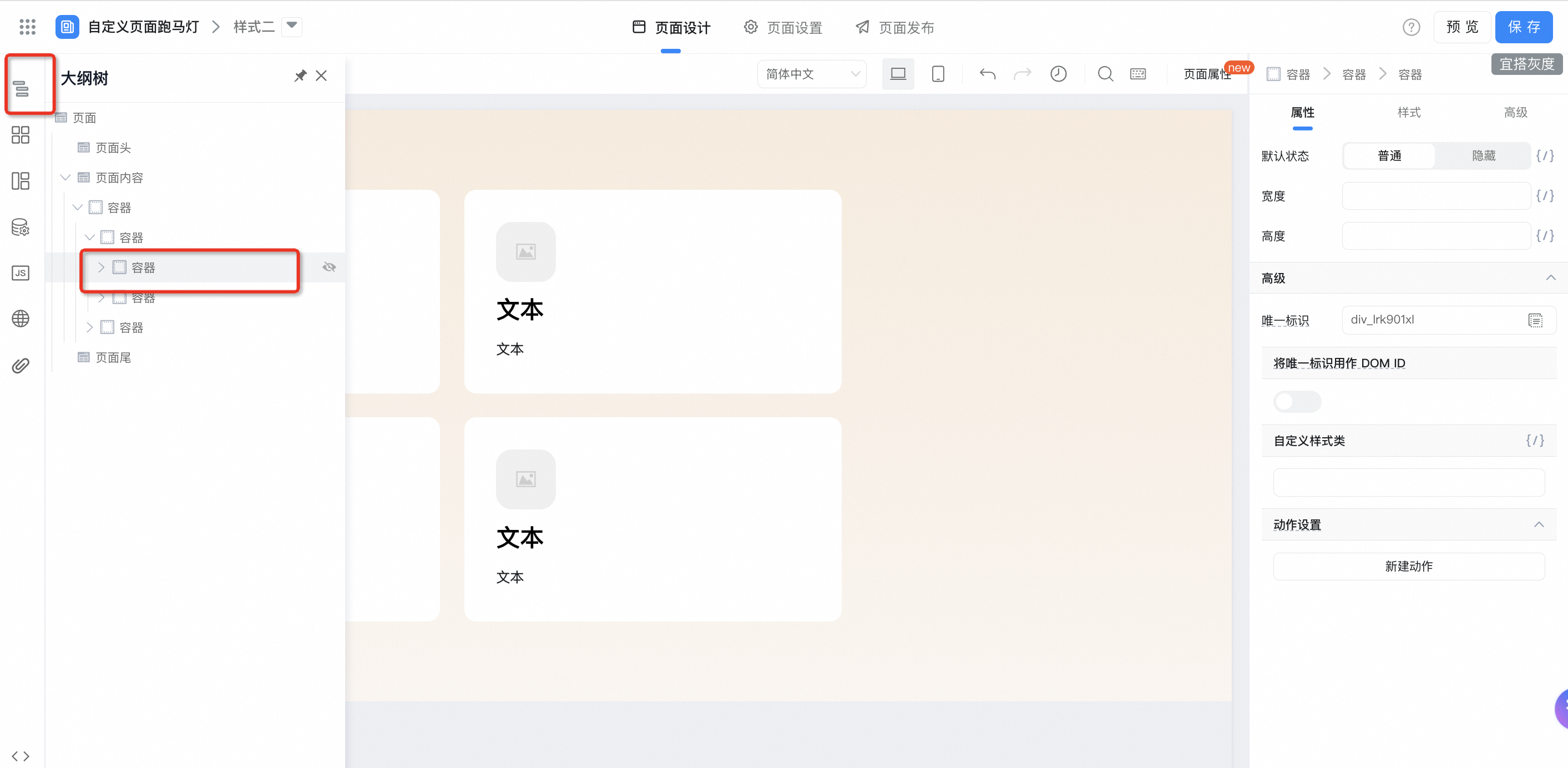
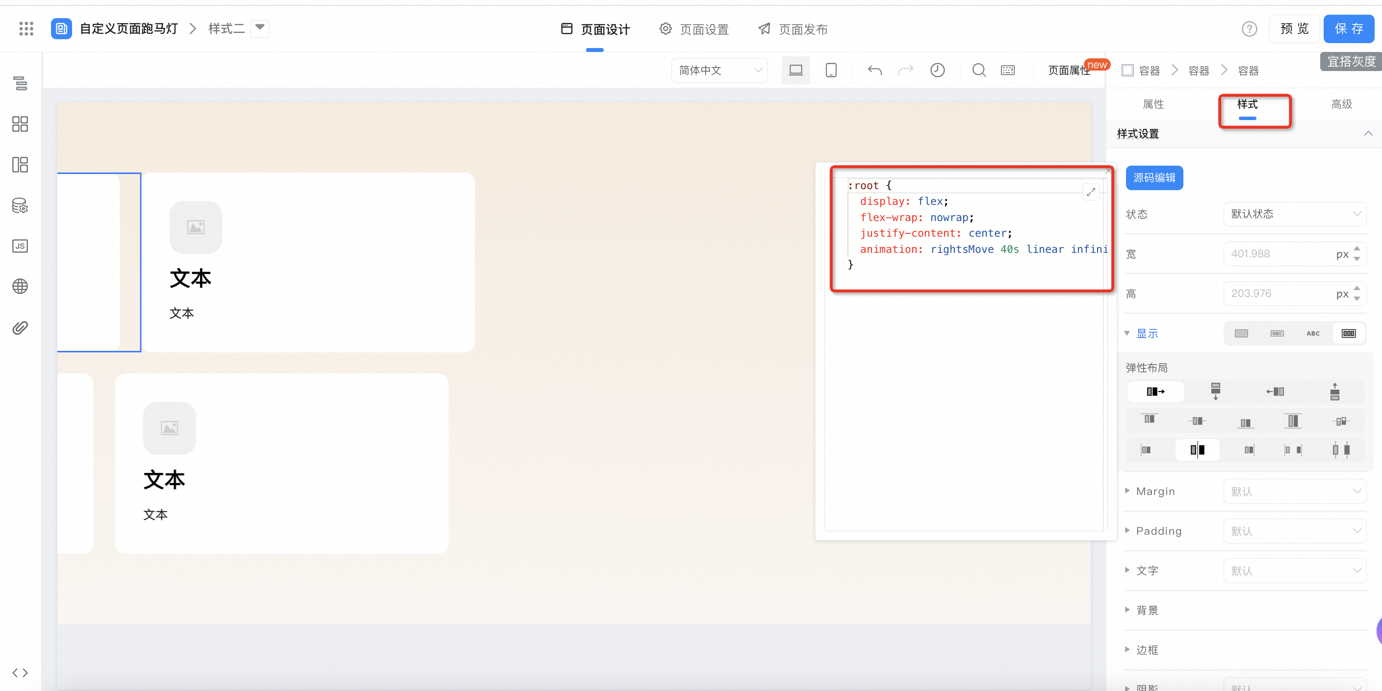
:root {
  display: flex;
  flex-wrap: nowrap;
  justify-content: center;
  animation: rightsMove 40s linear infinite;
}
2.2.2.5. Loop container configuration
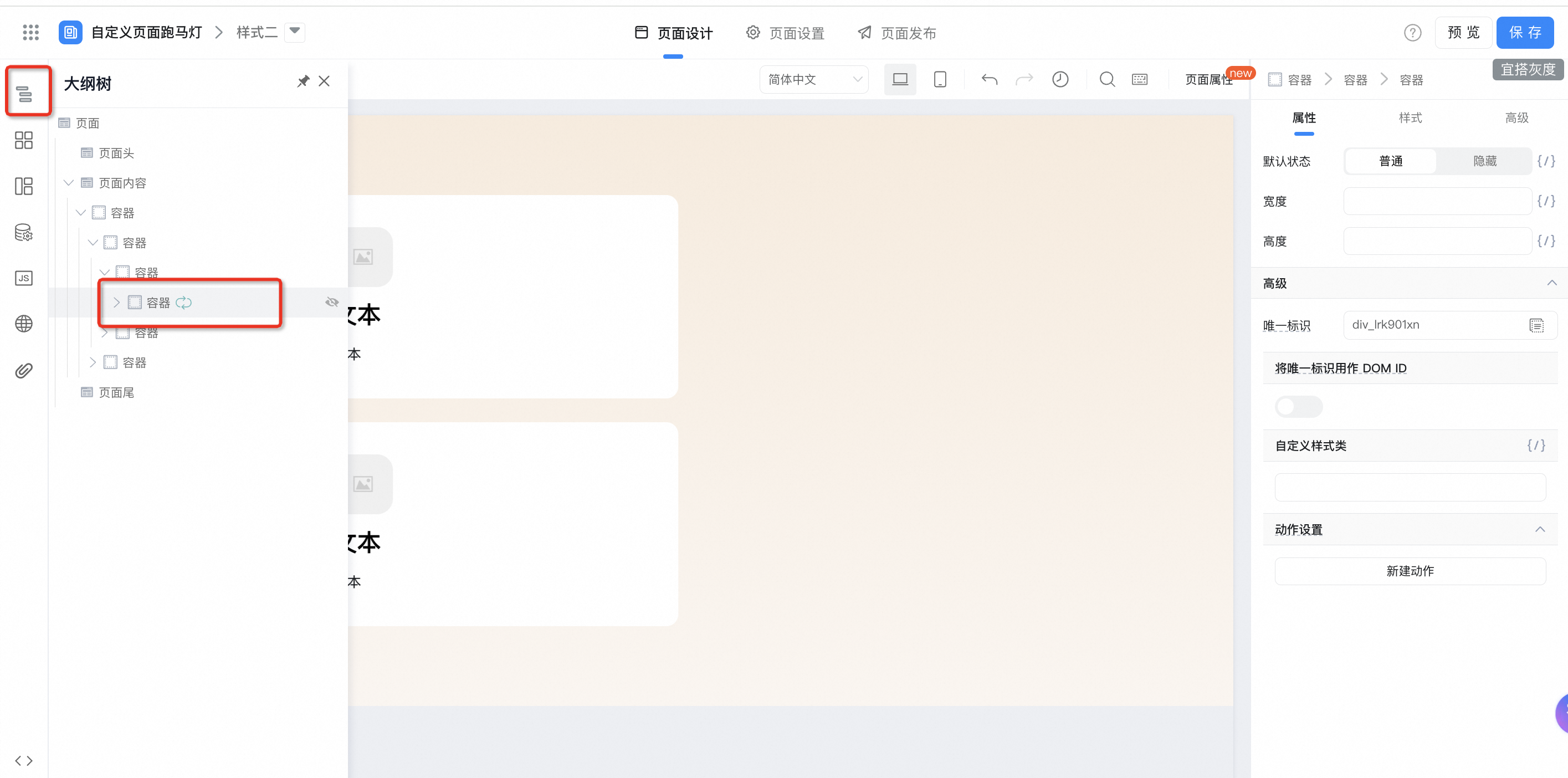
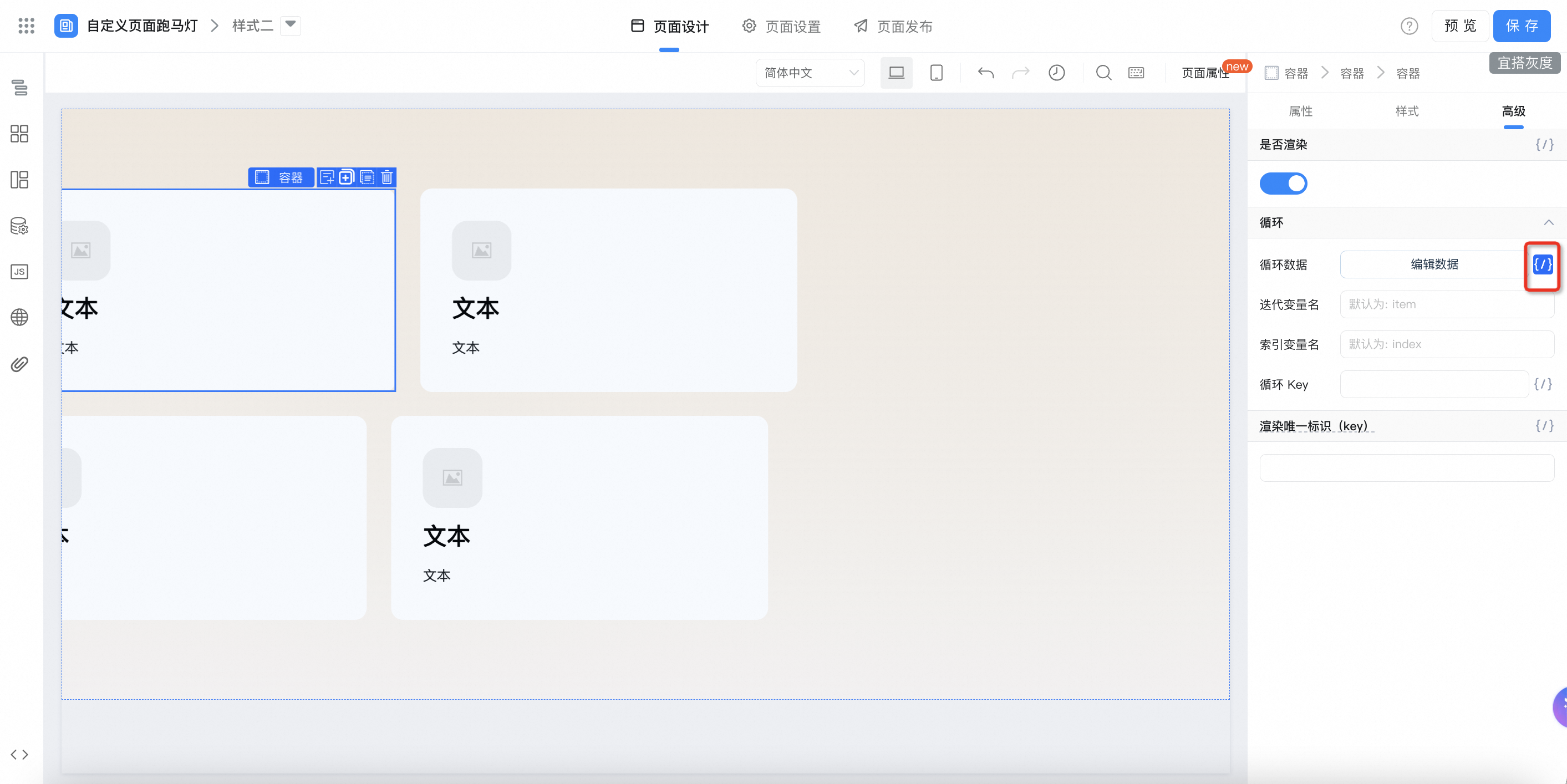
Bind data1 variable:
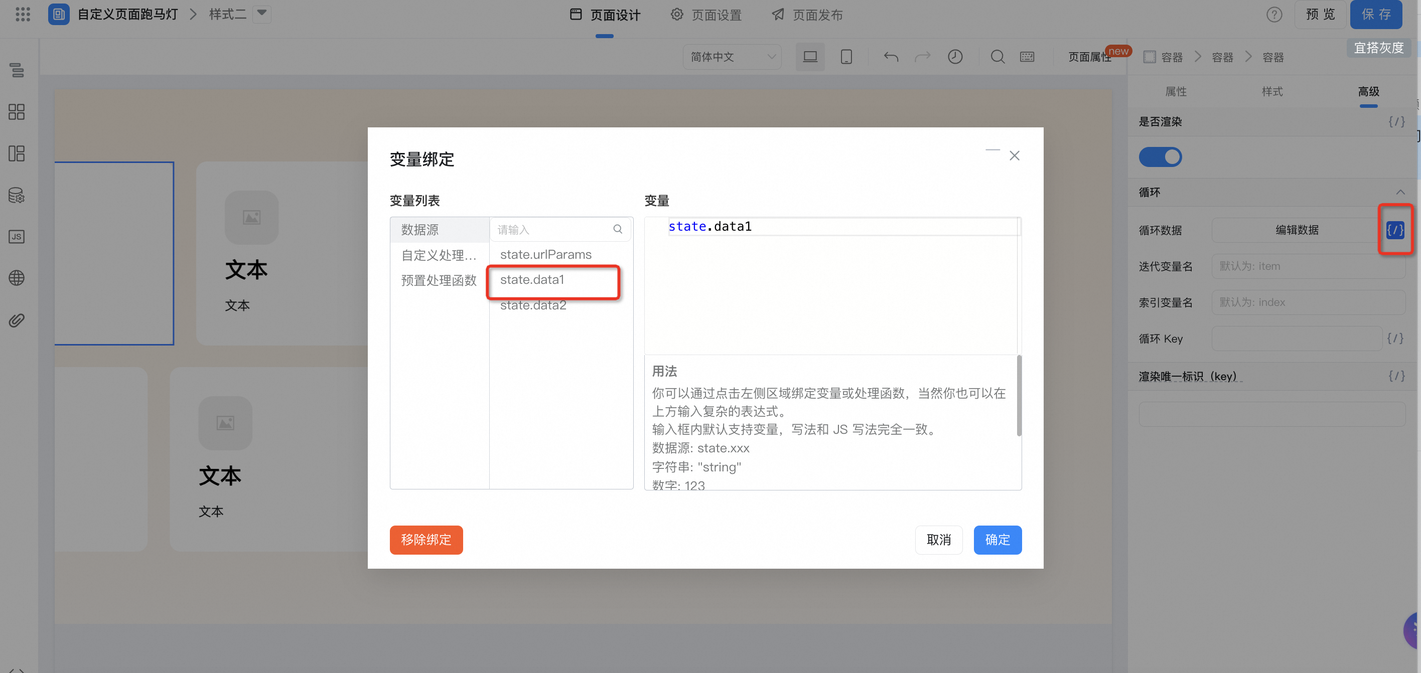
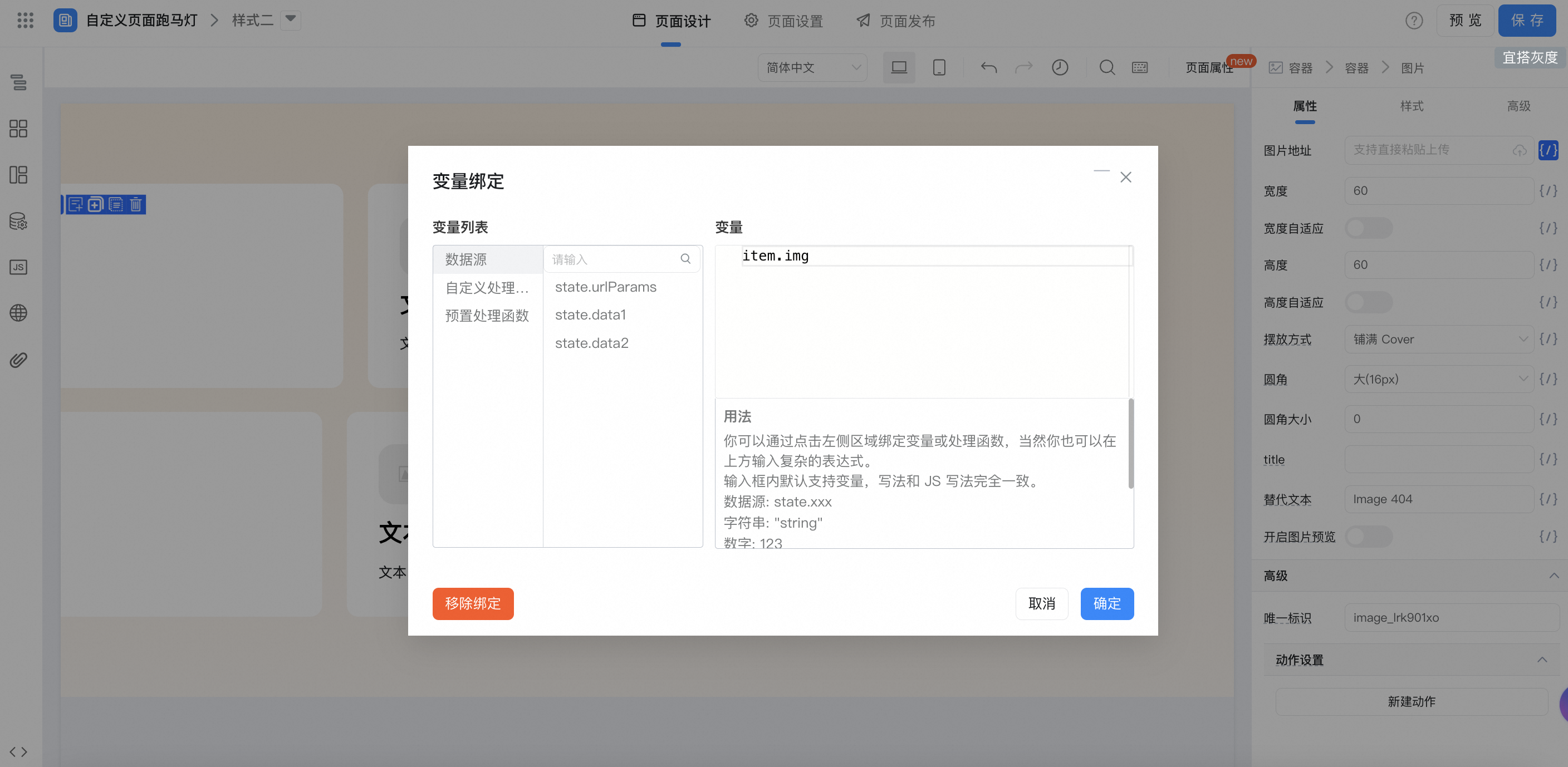
Image variable binding:
Text variable binding:
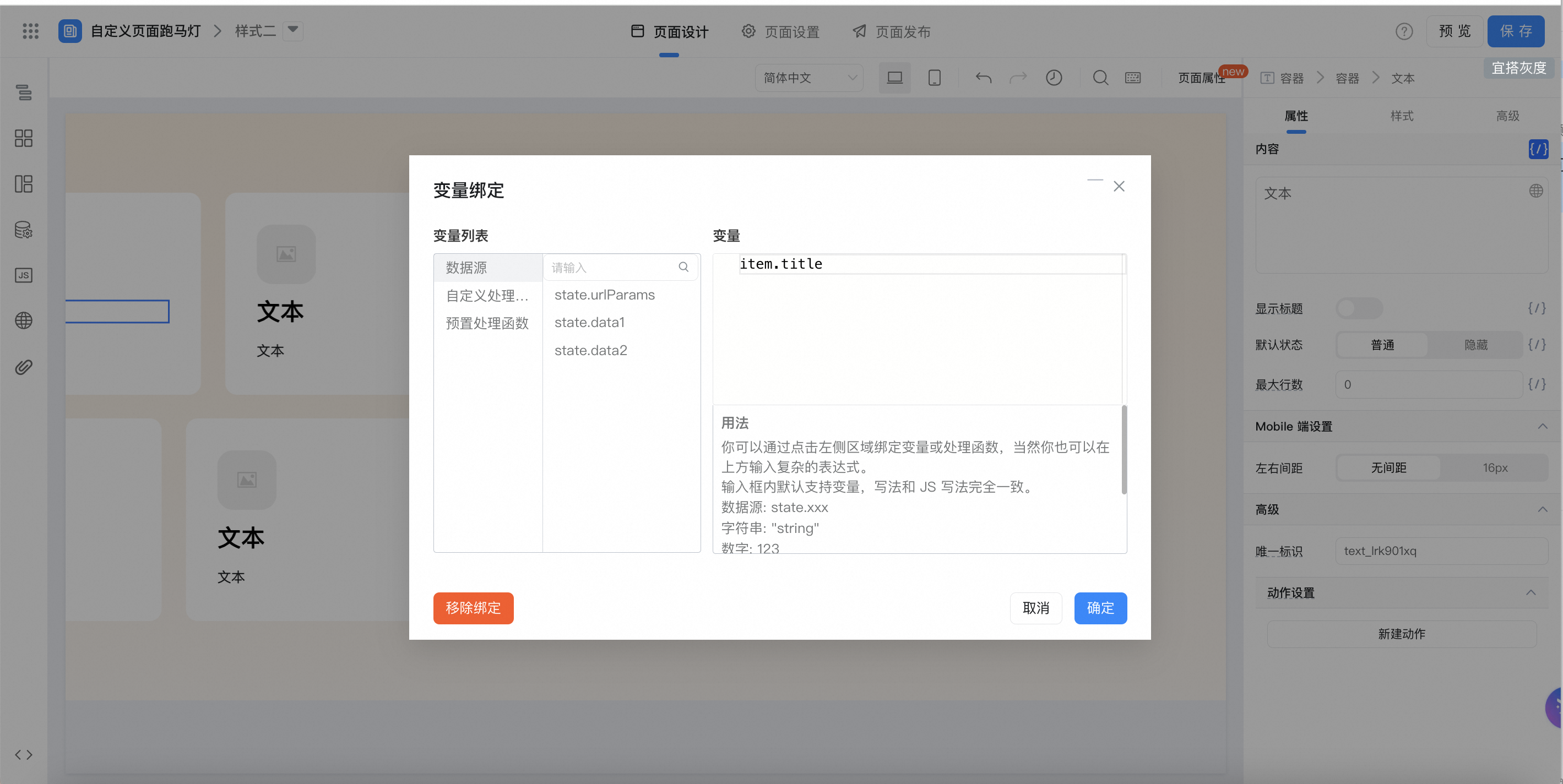
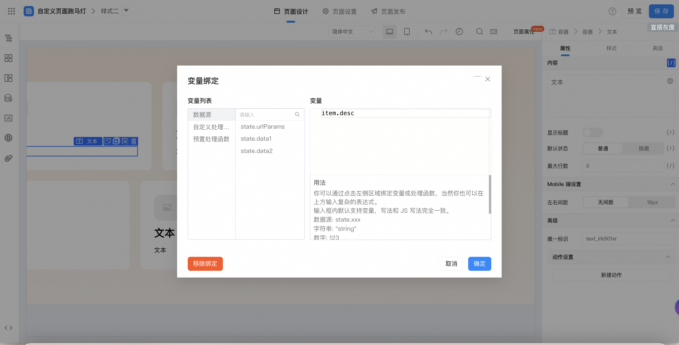
Loop container style settings:
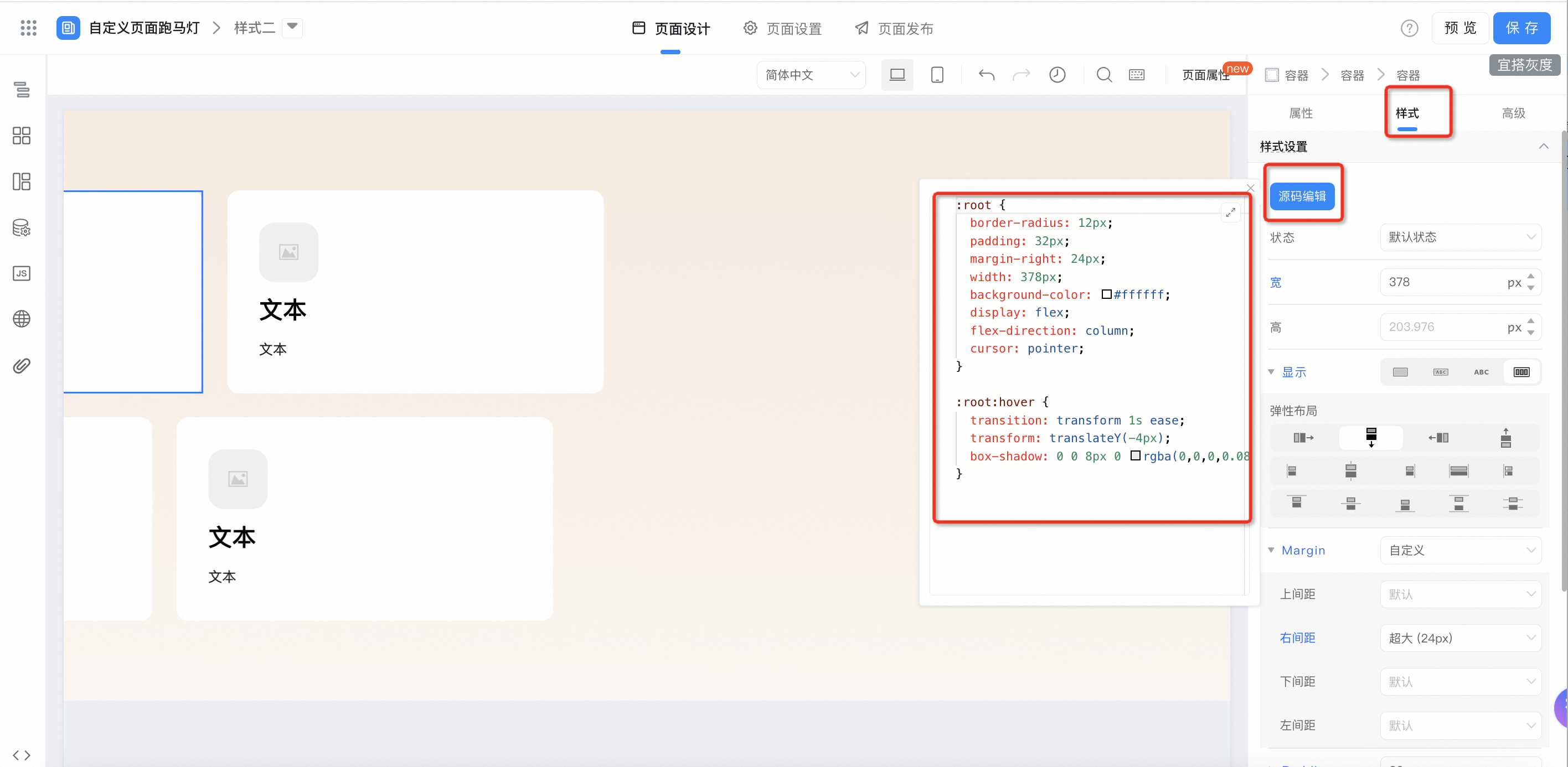
:root {
  border-radius: 12px;
  padding: 32px;
  margin-right: 24px;
  width: 378px;
  background-color: #ffffff;
  display: flex;
  flex-direction: column;
  cursor: pointer;
}

:root:hover {
  transition: transform 1s ease;
  transform: translateY(-4px);
  box-shadow: 0 0 8px 0 rgba(0,0,0,0.08);
}
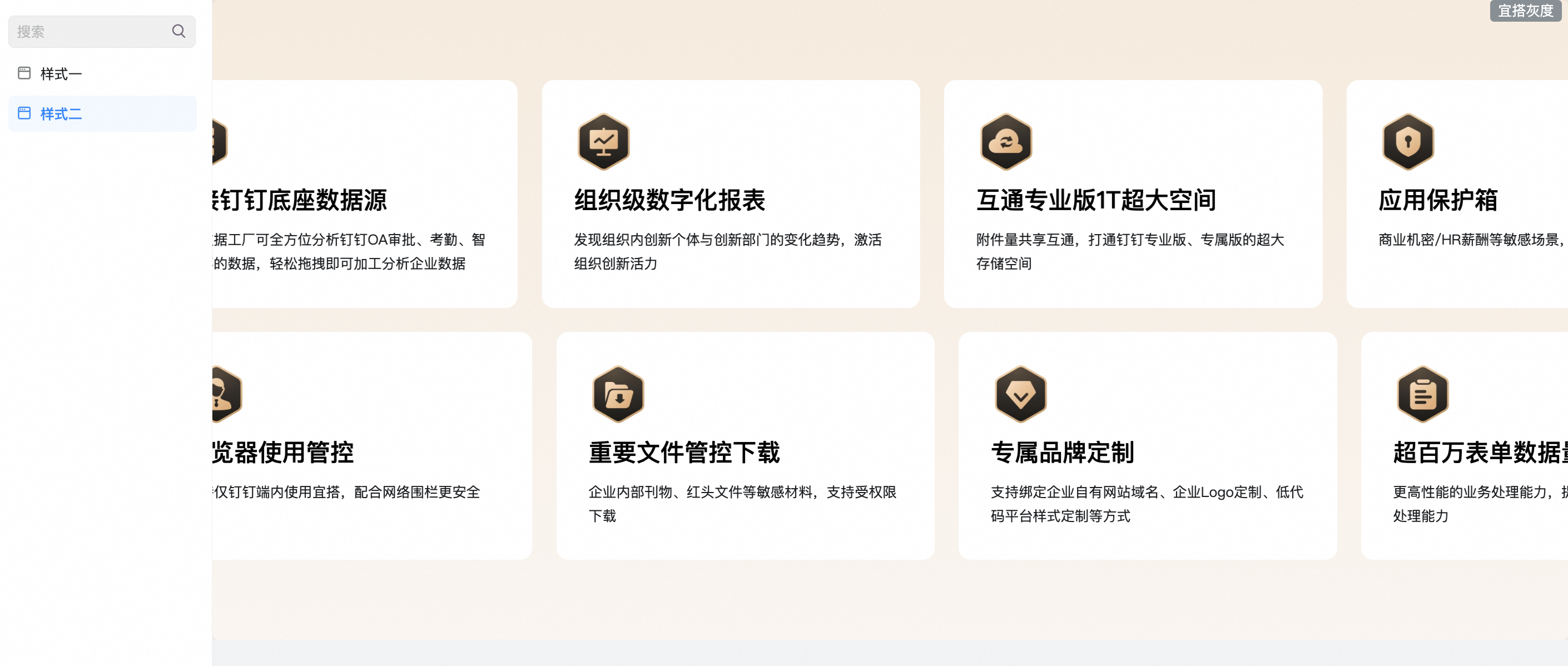
3. Effect

4. Try it online

This doc is generated using machine translation. Any discrepancies or differences created in the translation are not binding and have no legal effect for compliance or enforcement purposes.
Is this document helpful?