Custom Components
Ability | Free Edition | Light edition | Professional Edition | Exclusive Edition |
Custom Components | Not supported | Not supported | Support | Support |
1. Function introduction
1.1 Introduction to custom components
The custom component function provides customers with the ability to create components, improves the compatibility between components and business requirements, reduces the cost of component development and operation and maintenance, and improves the reusability of components.
1.2 Usage scenarios
When YIDA common components cannot meet the business needs of your application development, you can develop a component that fits the business scenario according to the business habits or needs of different industries. Custom components in the same organization can be shared, which facilitates the subsequent development of similar application reuse related components.
1.3 components
A component consists of views and properties. On the consumer side of the component, you can change the properties of the component to show different views.
View subdivision can be divided into design View and runtime view. Generally, Design View and runtime view can be reused.
On the production side of the component, we need to build the views and properties of the component respectively.
2. Operation guide
Use custom componentsText copyExperience the specific operations of developing, debugging, and installing custom components.
2.1 case scenario
Use the custom component function to transform the existing text components in YIDA with low code to realize the text copy function. It is used to copy text content to the clipboard to facilitate users to fill in duplicate fields.
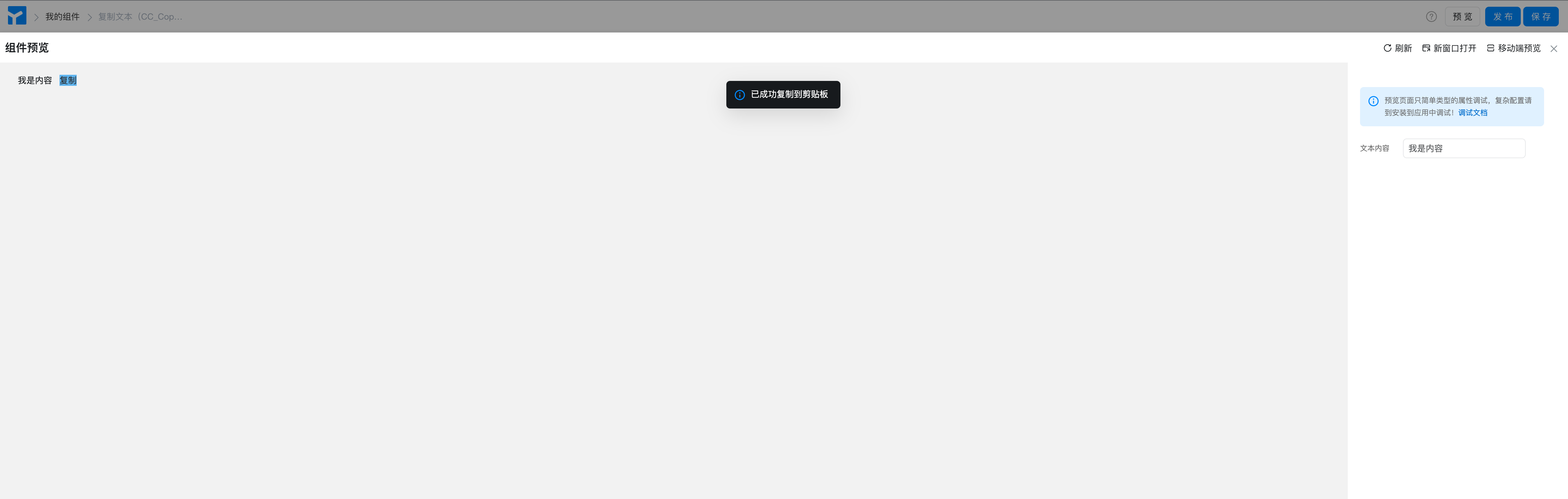
2.2 implementation effect
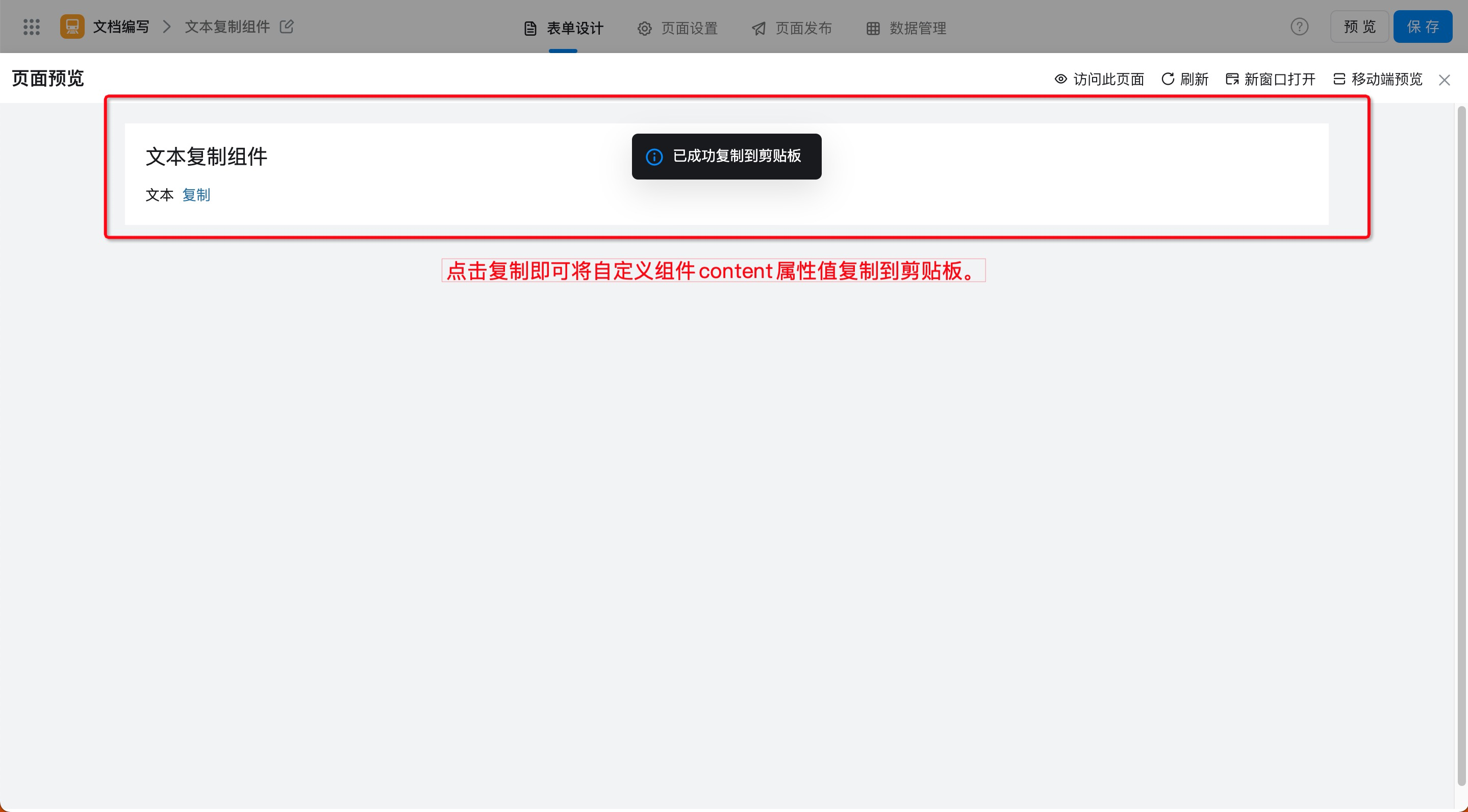
Figure 2.2-1 demo of copy text effect
2.3 Procedure
2.3.1 Step 1: Create a custom component
By configuring properties such as component name, type, and identifier,Low cost,CustomA moreMeet business requirementsThe component.
Procedure:
- YIDA applications> Application Settings> Component Management> component center (as shown in Figure 2.3-1)
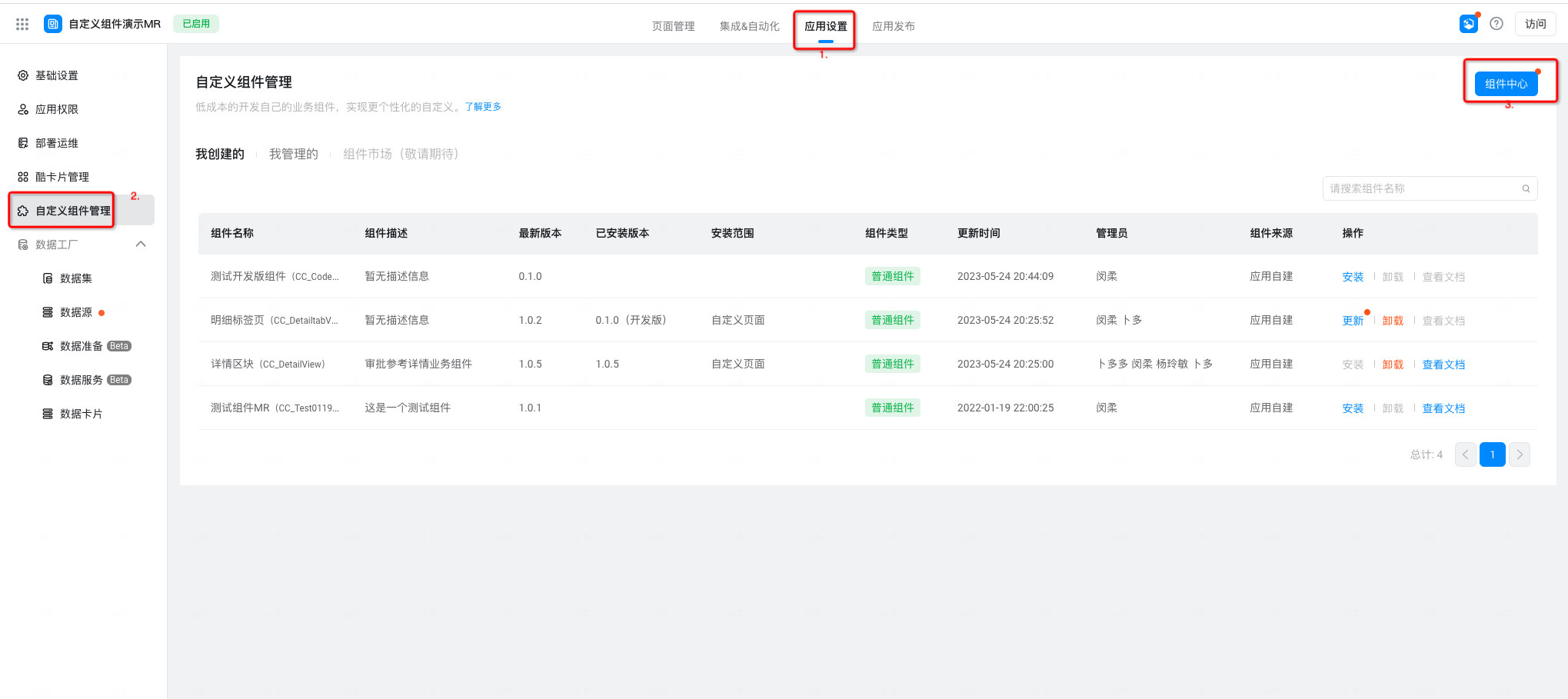
Figure 2.3-1 enter the component Center
- Add component> enter component name,Component Type, component attributes such as component identification> OK (as shown in Figure 2.3-2)
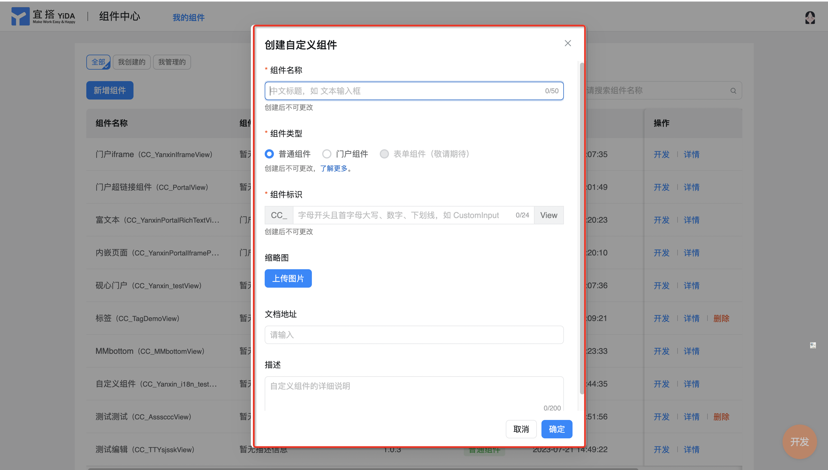
Figure 2.3-2 create a custom component counter
Note:
- Common components are generally suitable for makingDisplay typeBusiness functions without data storage capabilities. Therefore, data submission is not supported. When designing a component, you must confirm the real business usage scenario. If component elements such as text input boxes exist, the data submitted by the user will not take effect.
2.3.2 Step 2: develop and debug custom components
Develop and debug components to meet different business needs. In this example, the counting function of components is implemented.
Procedure:
- Component Center> my components> find the components to be debugged> develop (as shown in Figure 2.3-3)
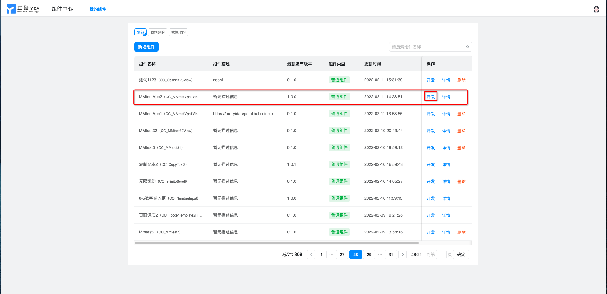
Figure 2.3-3 custom component development and debugging Portal
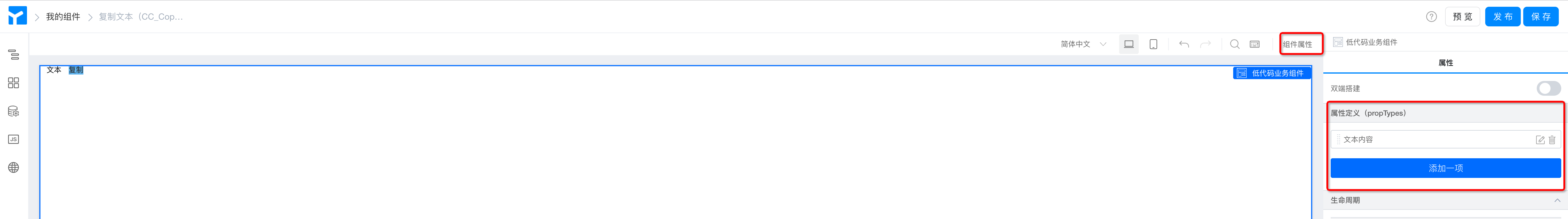
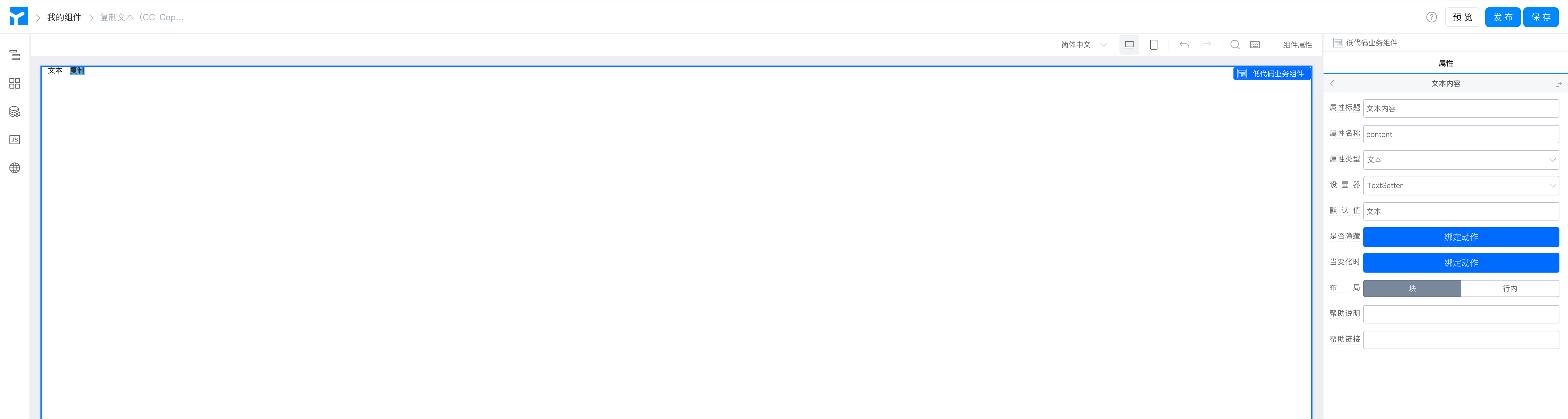
- As mentioned earlier, a component is built by views and properties. When developing a component, you need to abstract the properties required by the component first. First, I will build the properties of the component, this component only needs one attribute of text content, attribute configuration> attribute definition, adds an attribute of text content, whose name is content, attribute type selects text, and setter selects textSetter.
- After the component properties are built, build the component view and add the requiredYIDA common componentsGo to the canvas (in this case, the required components are two text components. Name it "text" and "copy" respectively), and configure the basic attributes. Bind the content of the text component to variables and bind it to the attribute props just built. content, so that the passed attribute values can be displayed at runtime. (Operation is shown in Figure 2.3-4)
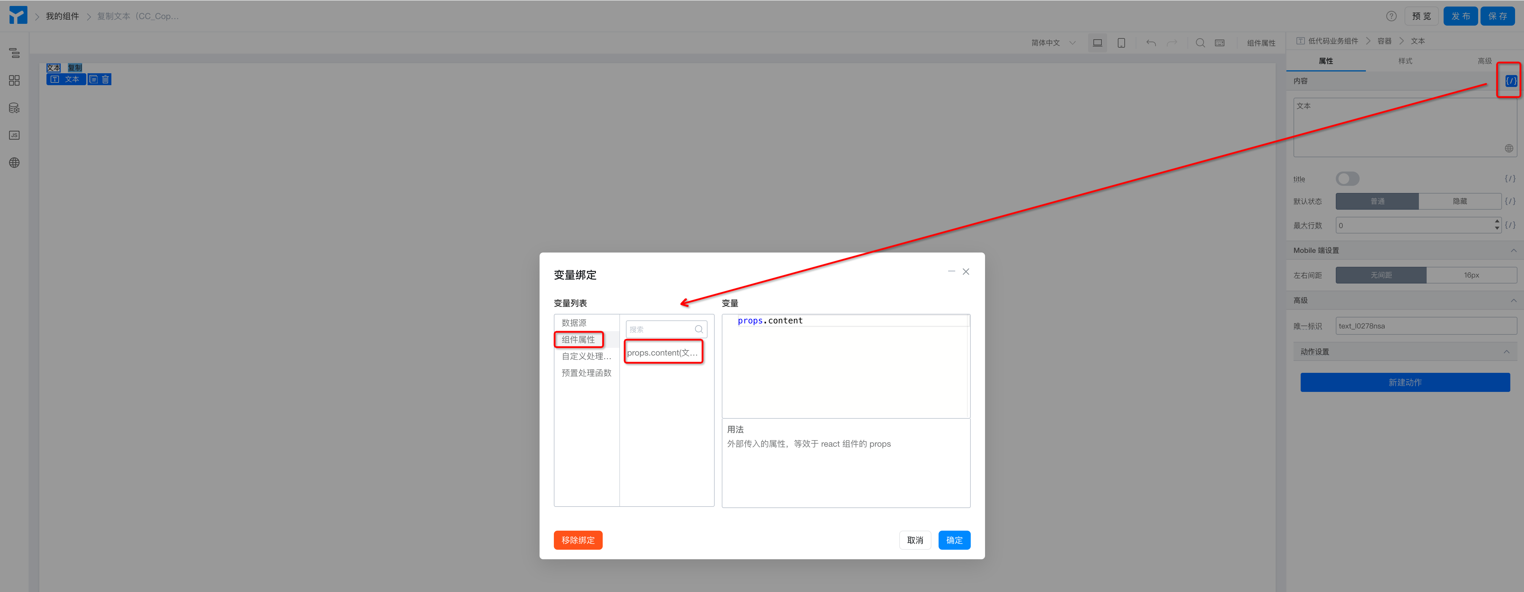
Figure 2.3-4 custom component style layout
- Set actions for the button component and copy the effect with text. Select copy text> Create action> onCopyText and click. (Operation is shown in Figure 2.3-5)
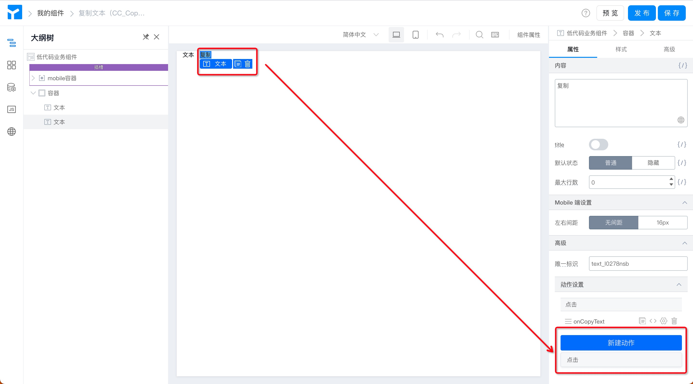
Figure 2.3-5 setting button action
- Write replication logic in the JS panel. (As shown in Figure 2.3-6)
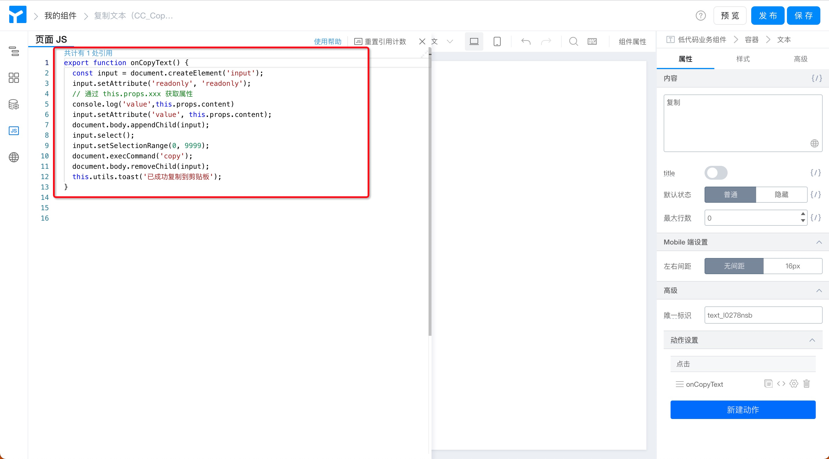
Figure 2.3-6 Copy button action code
export function onCopyText() {
  const input = document.createElement('input');
  input.setAttribute('readonly', 'readonly');
  // 通过 this.props.xxx 获取属性
  input.setAttribute('value', this.props.content);
  document.body.appendChild(input);
  input.select();
  input.setSelectionRange(0, 9999);
  document.execCommand('copy');
  document.body.removeChild(input);
  this.utils.toast('已成功复制到剪贴板');
}
- Save> preview components
- Publish> enterVersion numberAnd related instructions> OK. (Operation is shown in Figure 2.3-7)
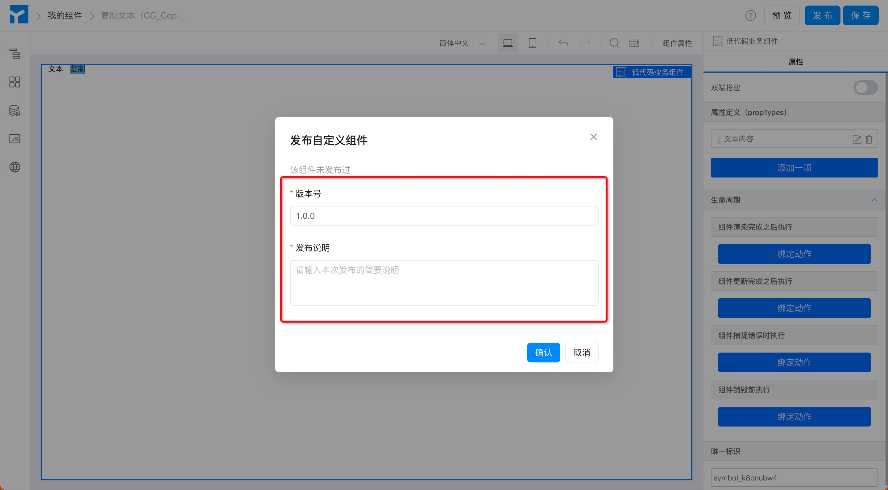
Figure 2.3-7 component release information
- If the release is successful, you will see a prompt. (The operation is shown in Figure 2.3-8) in the actual component development, after saving, the development version (0.1.0) of the component can be installed for real-time debugging, the official version must be released only after the component is developed.
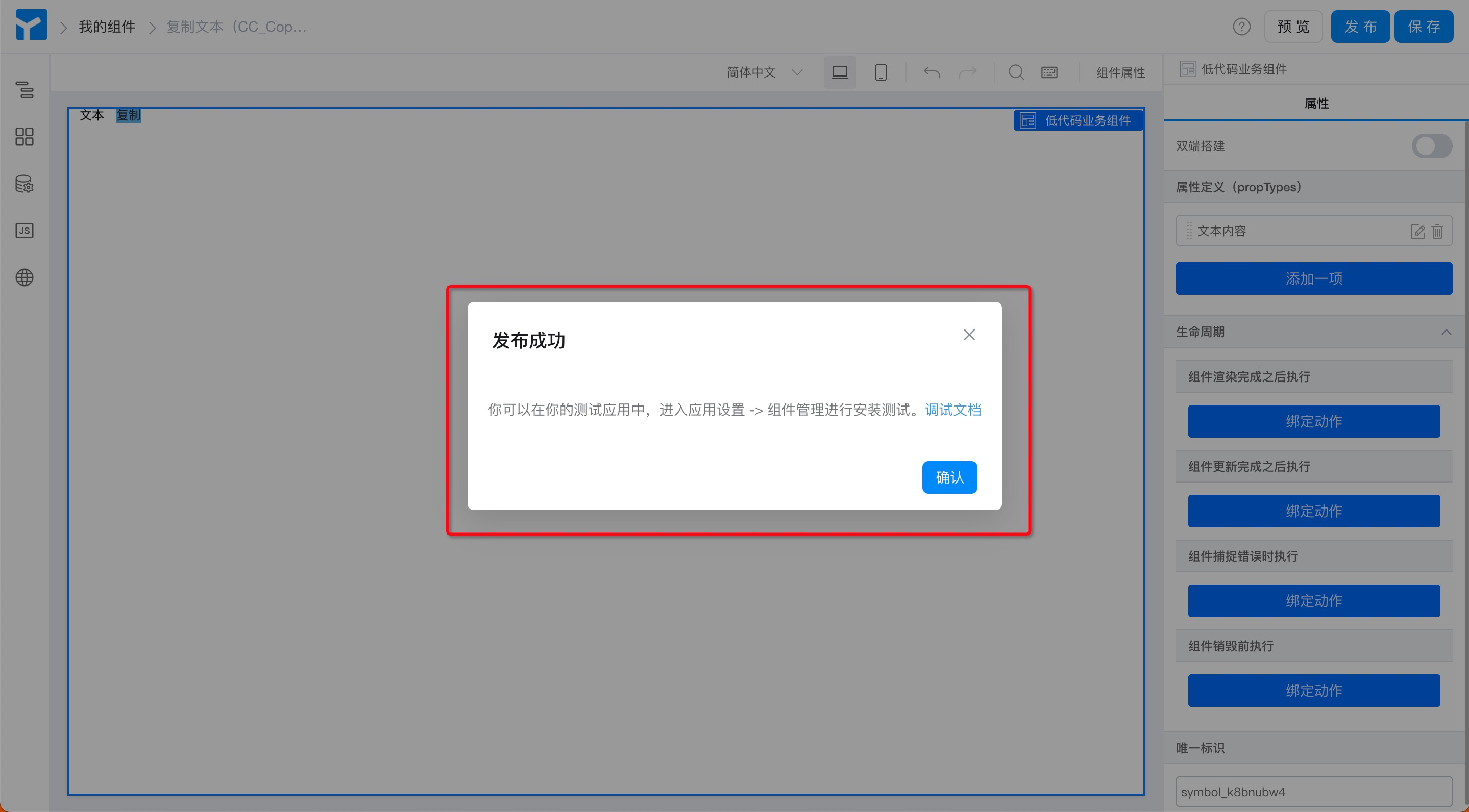
Figure 2.3-8 reminder of successful release
2.3.3 Step 3: install custom components
Install the custom components that have been developed and debugged into the page and use them during page design.Component installationYou must select a page type before you can see the corresponding custom component in the corresponding page designer.
Procedure:
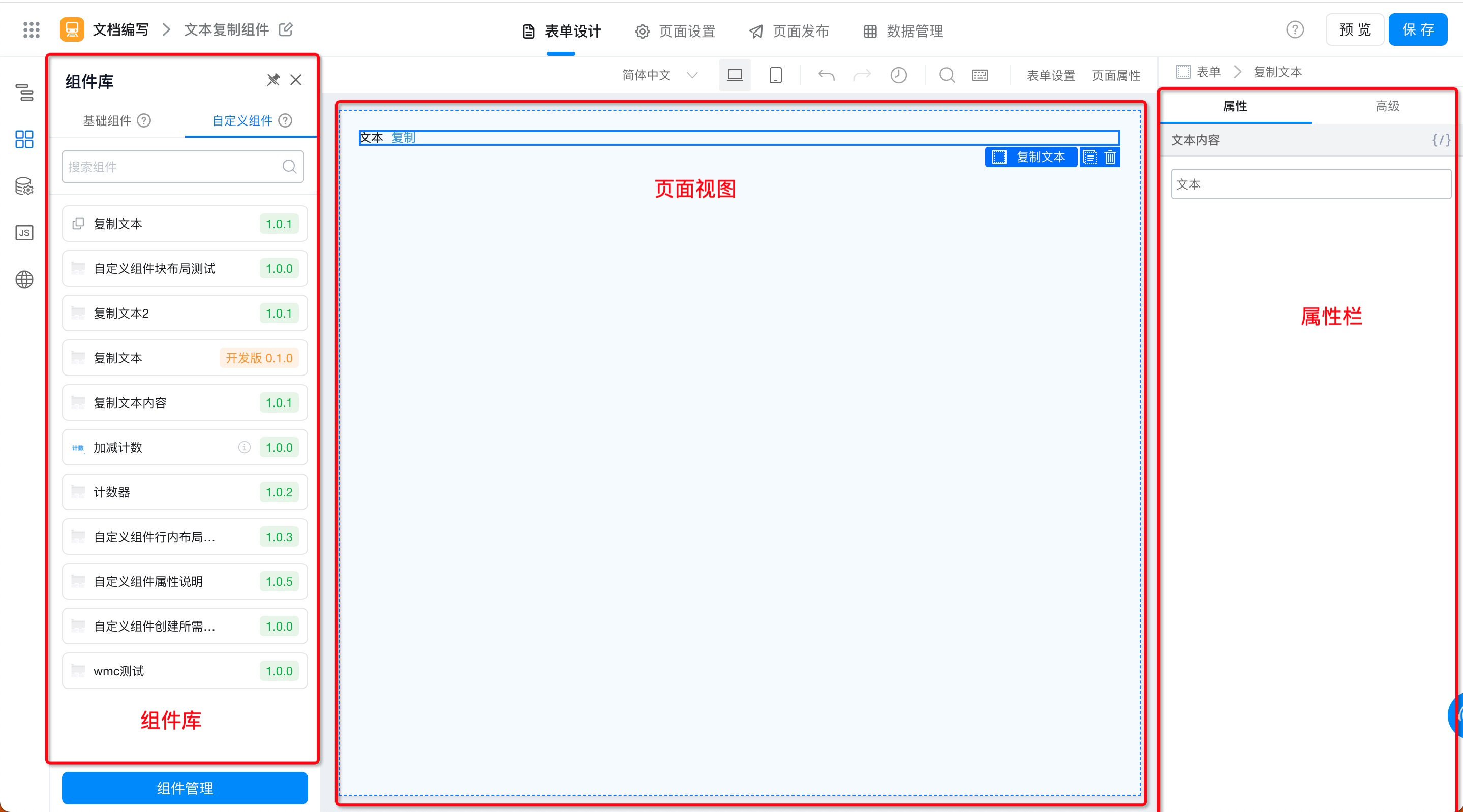
- Form design page> Component Library> custom components> Component Management. (Operation is shown in Figure 2.3-9)
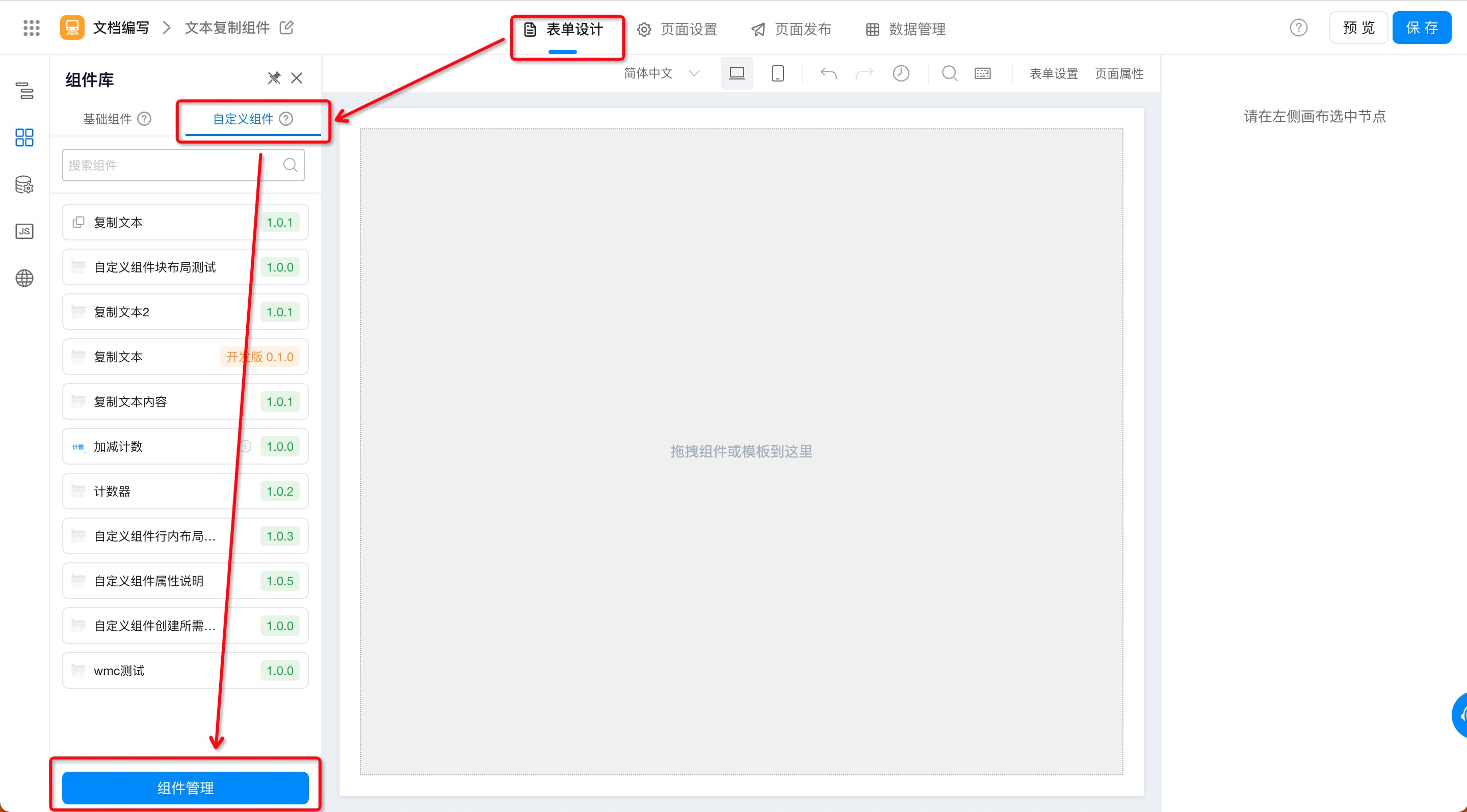
Figure 2.3-9 custom component installation portal
- Component Management page> Component List> select the custom component to be installed> install. (Operation is shown in Figure 2.3-10)
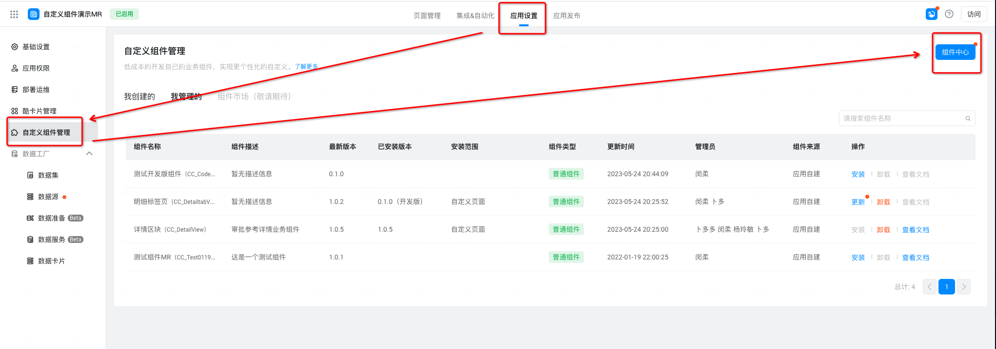
Figure 2.3-10 select the components to be installed
- SelectInstall versionAndInstallation scope> install. (Operation is shown in Figure 2.3-11)
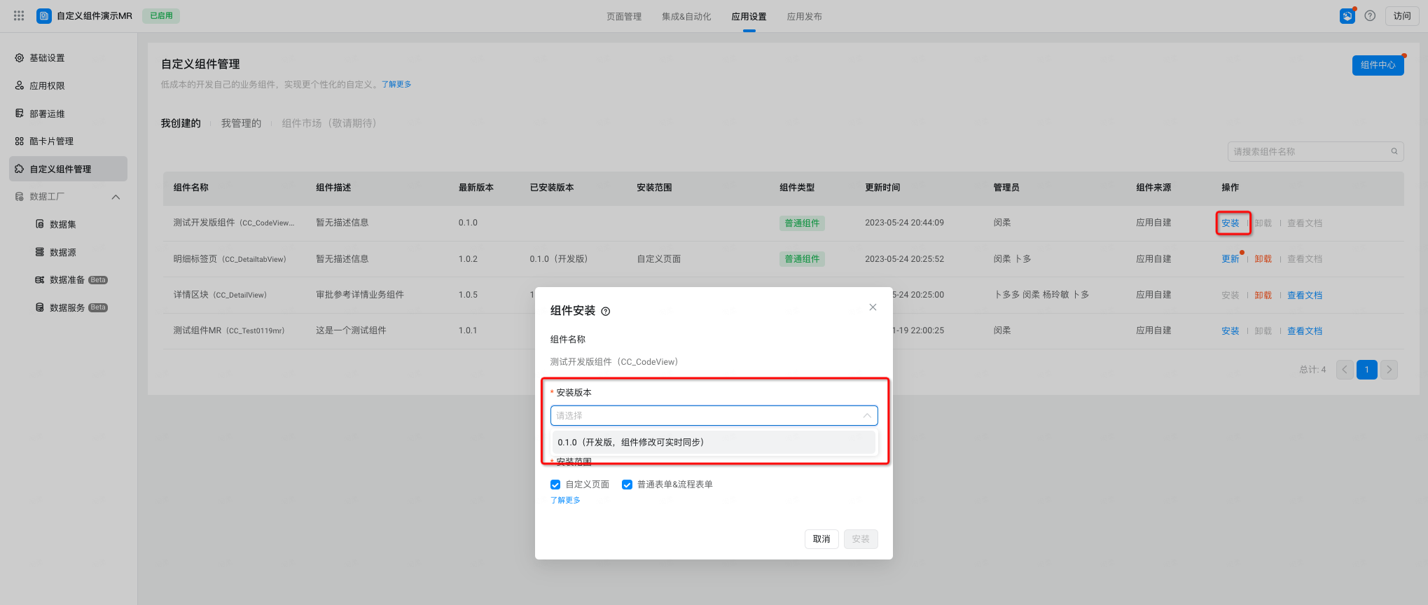
Figure 2.3-11 assembly installation
Note:
- To ensure the stability of using custom components online, when selecting component versions,Be sure to install the official version after the release of 1.x. x.
- To ensure that custom components can be used in the page designer, when selecting the installation range, only after selecting the corresponding page type, only in the corresponding page designer will you see the corresponding installed components.
- After this component is installed for the first time, you can update the component version.
2.3.4 Step 4: Use custom components
Through the preceding steps, the custom component has been installed in the custom component category of the page component library. The following steps can be used.
Procedure:
- Form design page> Component Library> custom component> select the required component> drag and drop to the canvas. (Operation is shown in Figure 2.3-12)
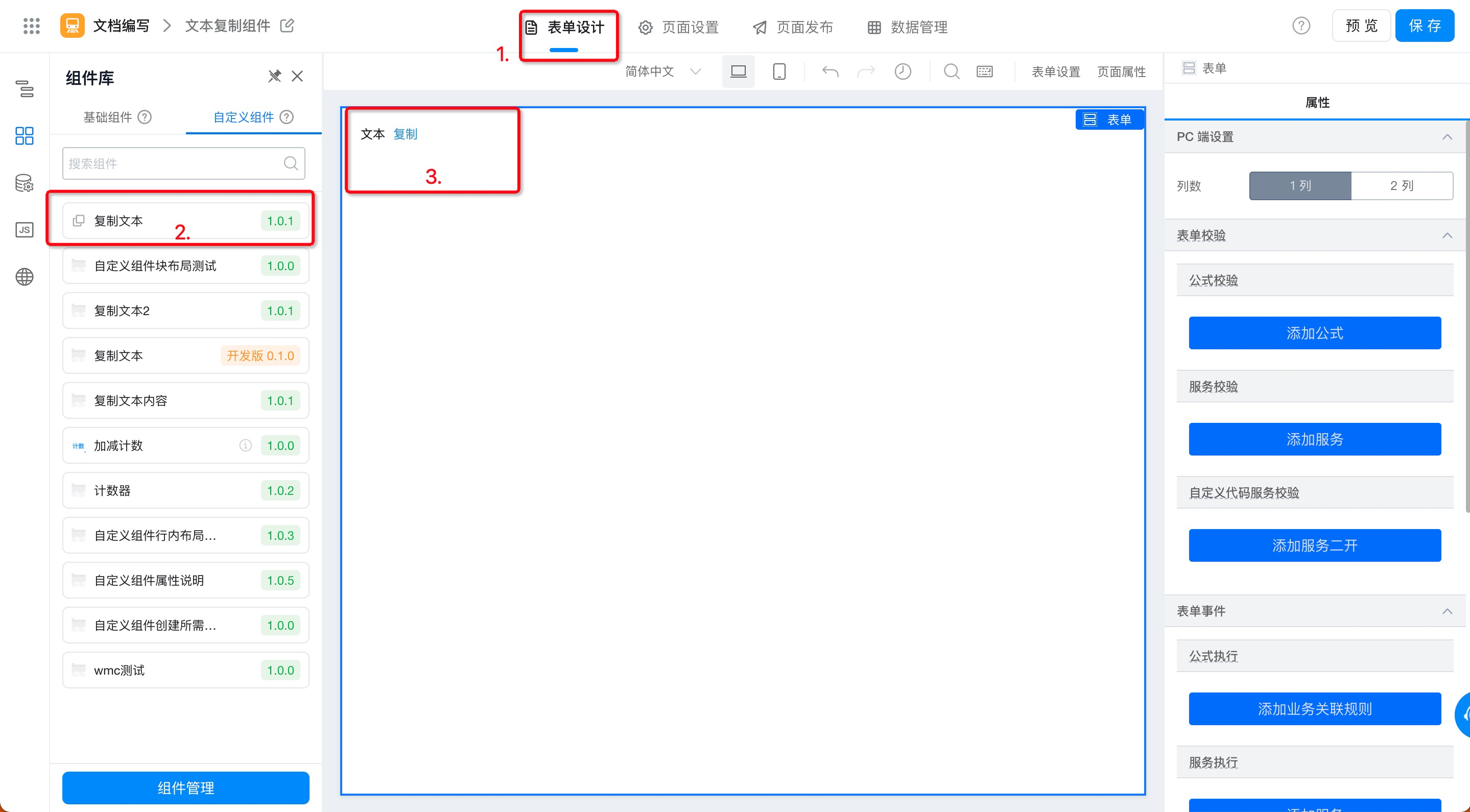
Figure 2.3-12 use custom components
2.3.5 Step 5: View/modify component information
In the process of using a component, you can modify the thumbnail of the component, the address of the component description document, and the description information of the component by using the following path.
Procedure
- Application Settings> Component Management> component center (as shown in Figure 2.3-13)
Figure 2.3-13 enter the component Center
- Select the component to view or modify the Details> details (as shown in Figure 2.3-14)
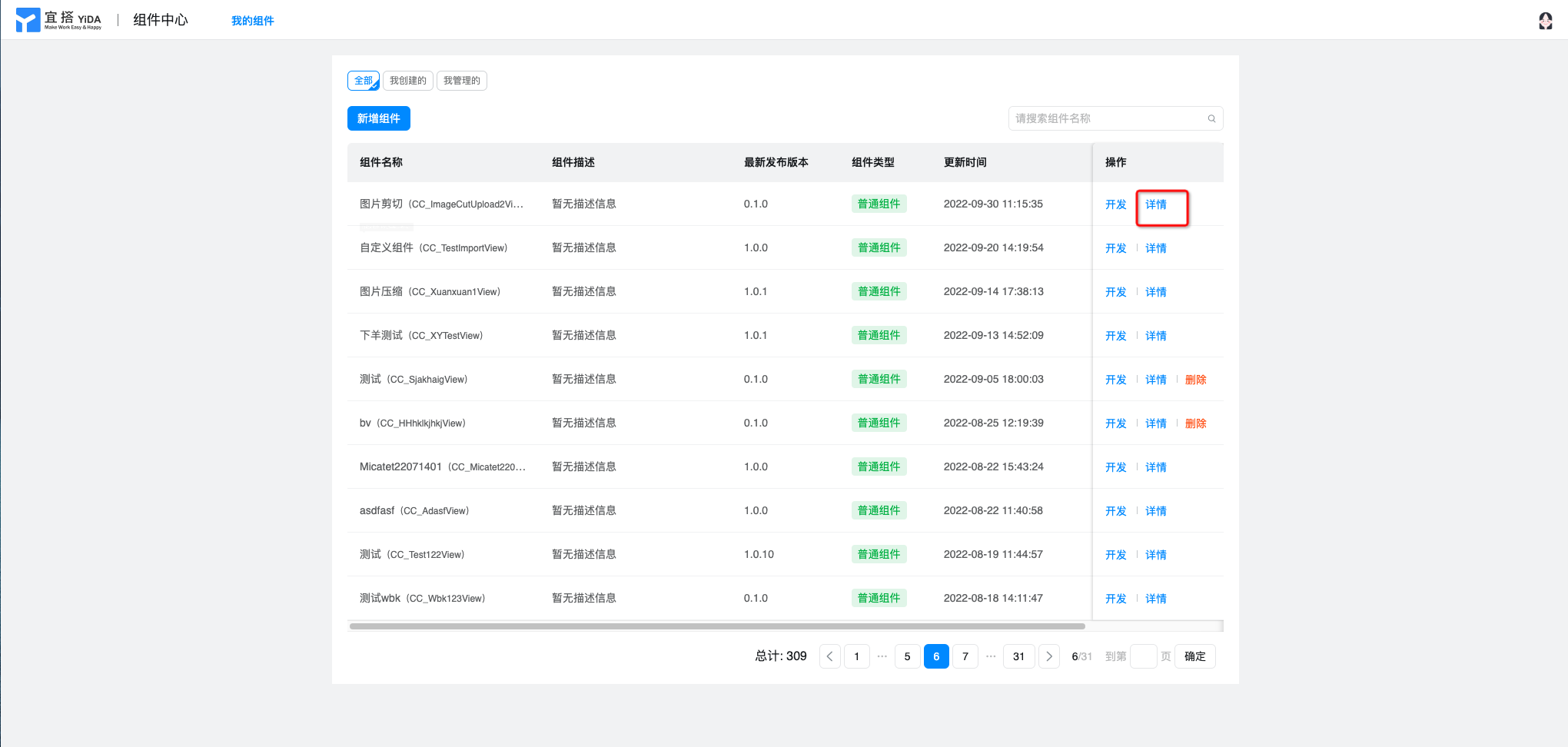
Figure 2.3-14 View component details
InstructionsThe component details page is dividedBasic information and release informationAndAdministratorThree modules (as shown in Figure 2.3-15), in which:
- Basic information: click edit to modify the thumbnail, help document address, and component description of the custom component. Other configurations are configured at the beginning of the component creation and cannot be modified.
- Publish information: You can view iteration records of custom components, including component versions and corresponding release notes.
- Administrator (has permission to develop and debug custom components. Default value: component creator): you can add or delete the administrator for permission management.
- Installation Information: You can view the historical installation information of this component (installation application, installation version, installation scope, installer, installation time)
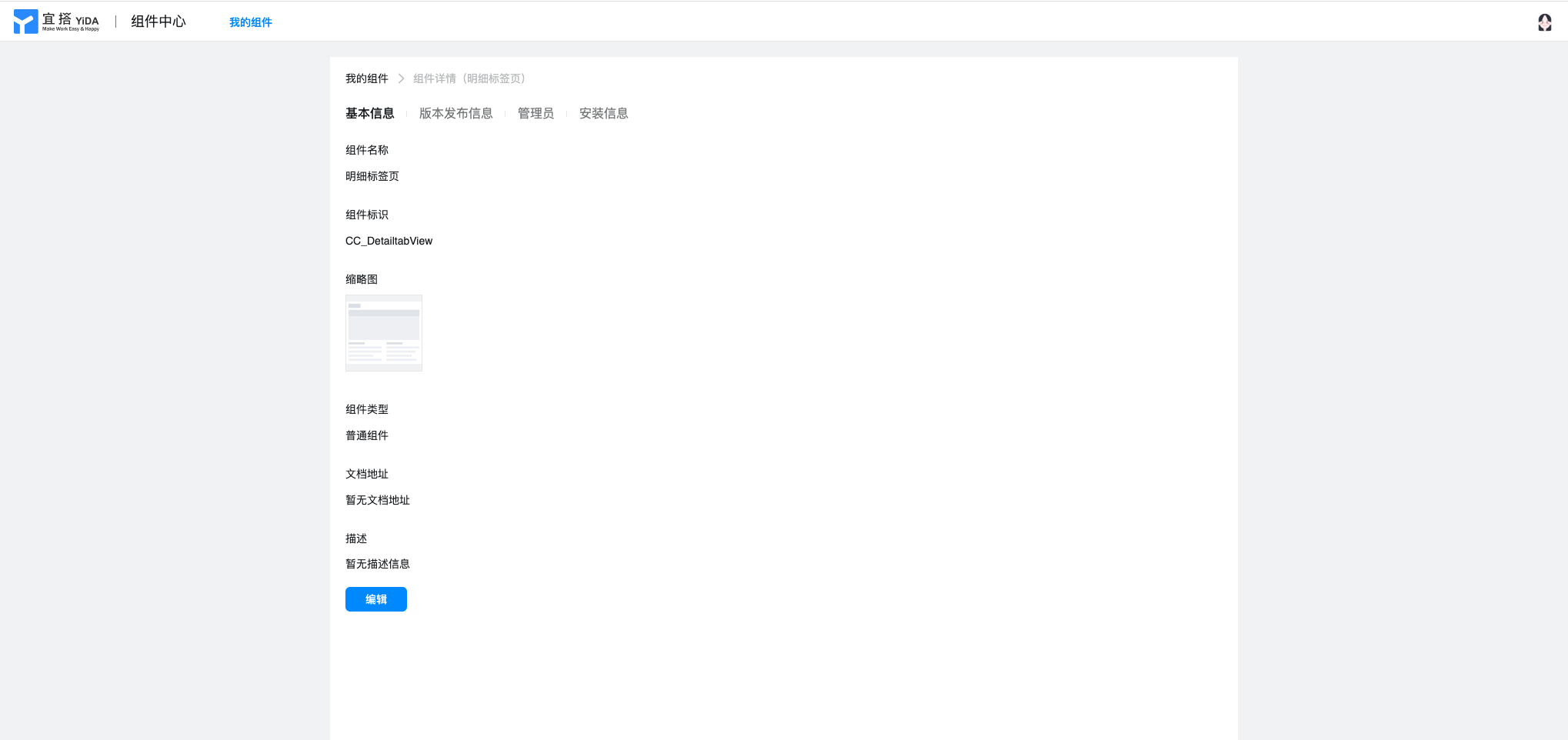
Figure 2.3-15 component details page
3. Customize component properties
Custom components support the modification of YIDA existing components, as well as the customization of properties (propTypes) of the generated custom components. Make custom components more suitable for developers' daily work scenarios and daily work habits, and at the same time make custom components more flexible and customizable.
3.1 custom component property configuration Portal
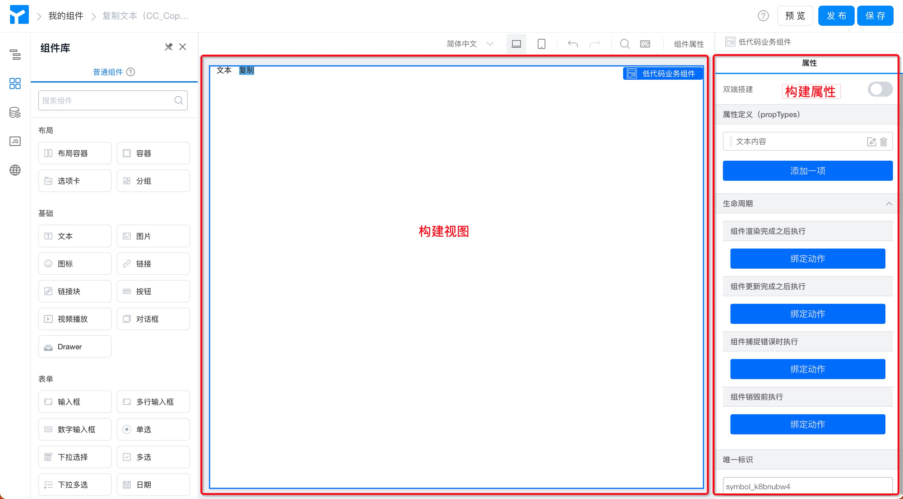
Path:Low code component designer> select low code business component> right attribute in the canvas (the path is shown in Figure 3.1-1)
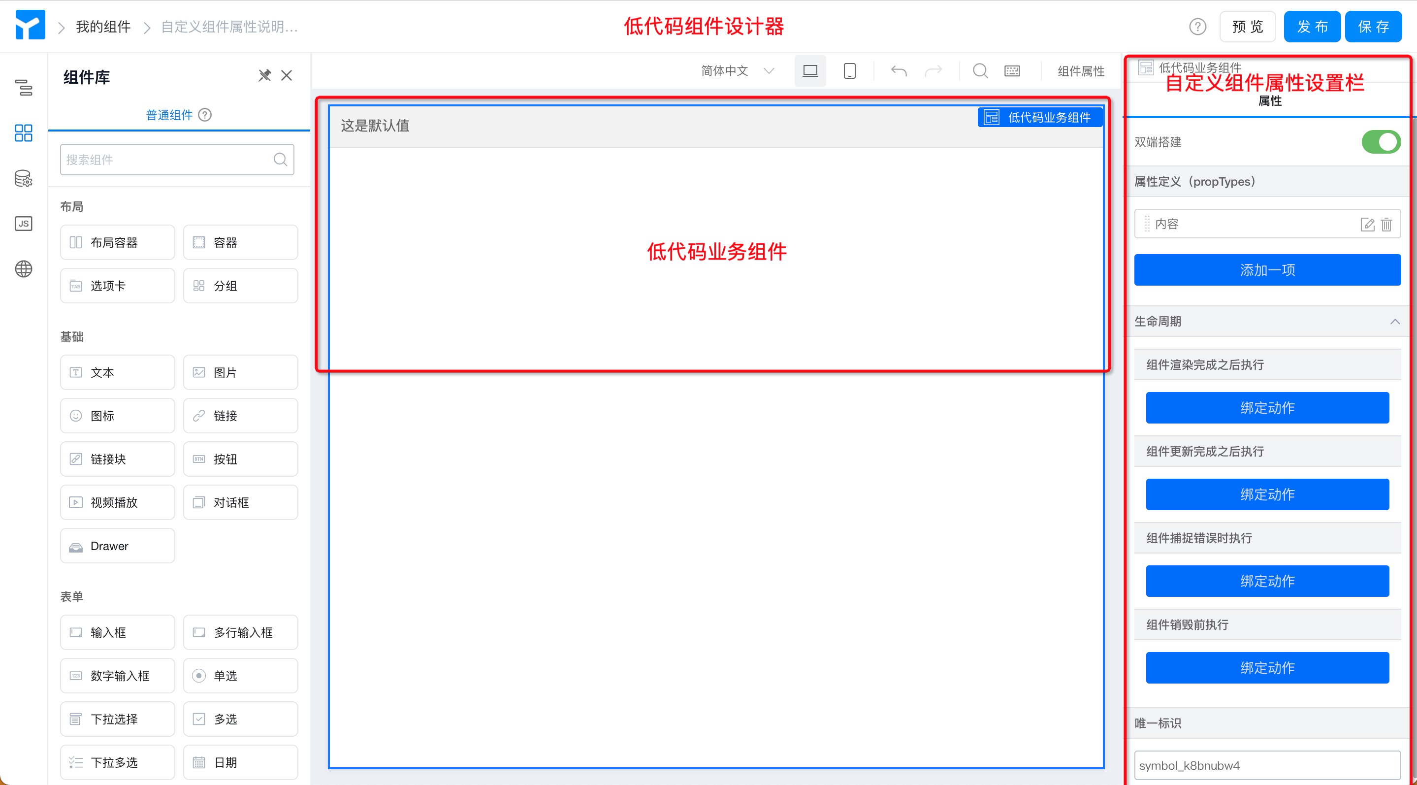
Figure 3.1-1 Custom component property configuration entry
3.2 custom component attribute configuration description
Custom component attributes are dividedDouble-end construction and attribute definition (propTypes). LifecycleAndUnique IdentifierFour modules. Among them,
- Double-end construction:The two-terminal is built as a configuration switch, and the PC terminal and the mobile terminal can be completely separated and designed separately to meet the individual business needs of the two-terminal adaptation.
- Attribute definition (propTypes ):For custom componentsTitle,Name,Type (data format),Default valueYou can also customize basic attributes such as components.Hide or not (whether the component is hidden or not),When it changes (the display value of the component is different)Bind events to meet a variety of business needs. For more information, see,组件属性配置.
- Lifecycle:The lifecycle of custom components is dividedComponent rendering completed (
componentDidMount),Component update completed (componentDidUpdate),Component capture error (componentDidCatch),Before the component is destroyed (componentWillUnmount)In four phases, different logic is written in different life cycles to meet complex business needs. - Unique ID:Like YIDA common components, custom components also have unique identification attributes. As the unique identification code of the component, it is automatically generated by the system and generally does not need to be changed. Used to store data and bind code in the background YIDA.
Special attention:
- ComponentfiedId is the unique identifier that YIDA points to the component., changing the ID may affect the formula used on the component, data storage (data may also be lost), pointing on the JS function side, etc.We strongly do not recommend that you modify the unique identifier attribute of the component!
- If you insist on modifying the logo (currently only throughschema import method, if you choose to use this method to modify the unique identifier of the component, it means that you have made it clear that you will bear the consequence alone. YIDA have the right not to take any responsibility for the consequence, thank you for your understanding and support.
4. Appendix
4.1 Component Type
YIDA custom component typesCommon components 」,Form components, portal components 」Three types of core areas are:
- Common components are generally used to makeDisplay functions, no data storage capability. Similar to the existing graphic display group component.
- Form components can be used to makeData Submission, form components are more complex than common components in development, and you need to define additional metadata configurations.
- The form component is not available.
- Portal components are generally usedDisplay functions, no data storage capability. Applicable to portal pages.
4.2 component installation type
YIDAPage typeThere are common form pages, flow sheet pages, report pages, DataV screens, custom pages, external links, and Portal pages.
YIDA custom components (common component types) currently support installation on custom pages and common forms & flow chart.
After you select the corresponding page type during installation, you will see the corresponding installed components in the corresponding page designer.
4.3 component version description
YIDA custom component versionsDevelopment EditionAndOfficial Version.
We are inSemantic versionOn the basis of this, additional agreements have been made.
- 0.1.0 is the development version by default. The development version can be synchronized with the component designer in real time to debug components.
- 1.x. x is the official version after the release, which will fix the functions of the current version to ensure the stability of online use of this component.Therefore, please install the official version after the release of 1.x. x for online formal applications.