Component properties
1. Introduction to component properties
Custom components support attribute definition (propTypes) operations, which are used to enrich components at the attribute level, increase customization of custom attributes, and make them more flexible and fit business needs. (As shown in Figure 1.1-1)
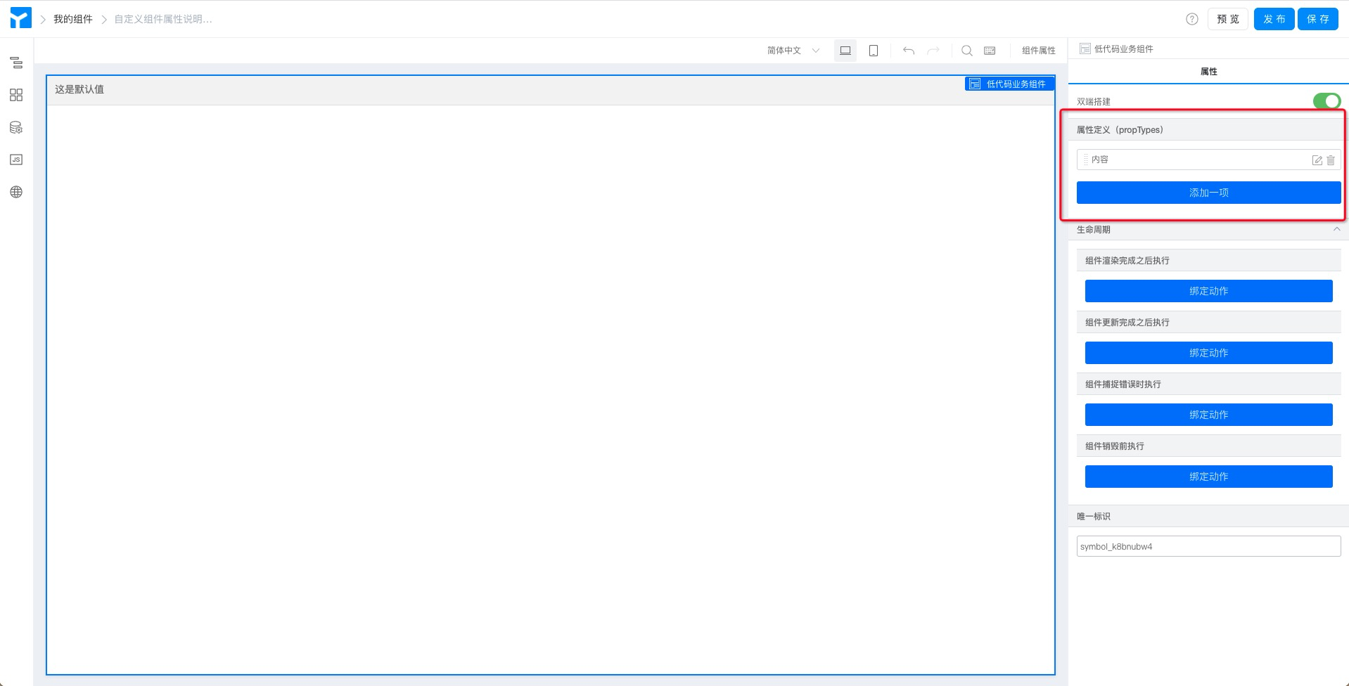
Figure 1.1-1 component attribute definition entry
You can add component attributes by using the add item button, modify the attributes by using the edit button, and delete the attributes by using the delete button. Click edit to see all configuration items of component properties. (As shown in Figure 1.1-2)

Figure 1.1-2 custom component property definition configuration items
All custom component attribute definitions can be installed in the component preview interface (simple type of attribute debugging) or in applications (complex attribute configuration: including debugging work involving code) view and configure. (As shown in Figure 1.1-3)
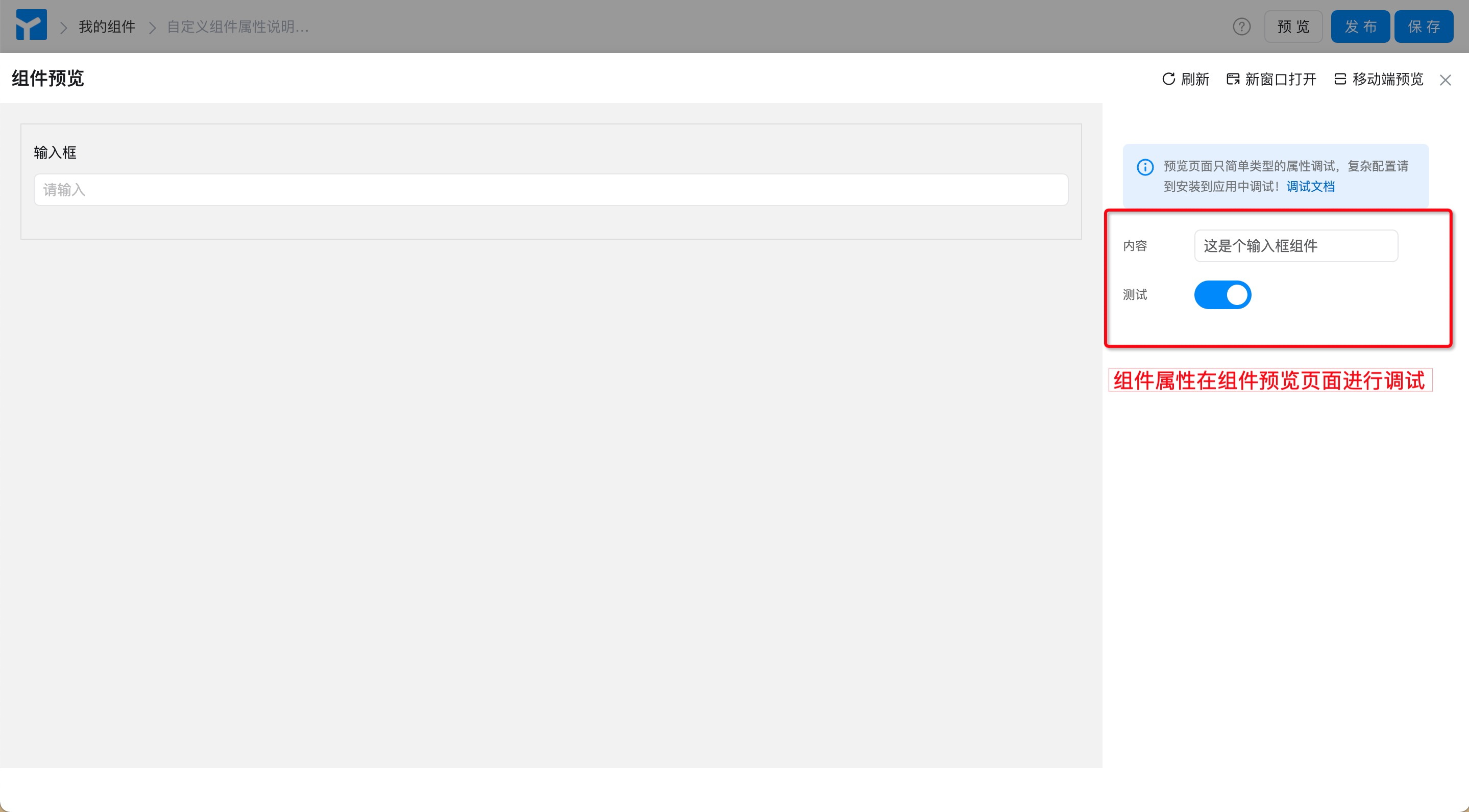
Figure 1.1-3 preview debugging of component properties
For more information about each configuration item, see below.
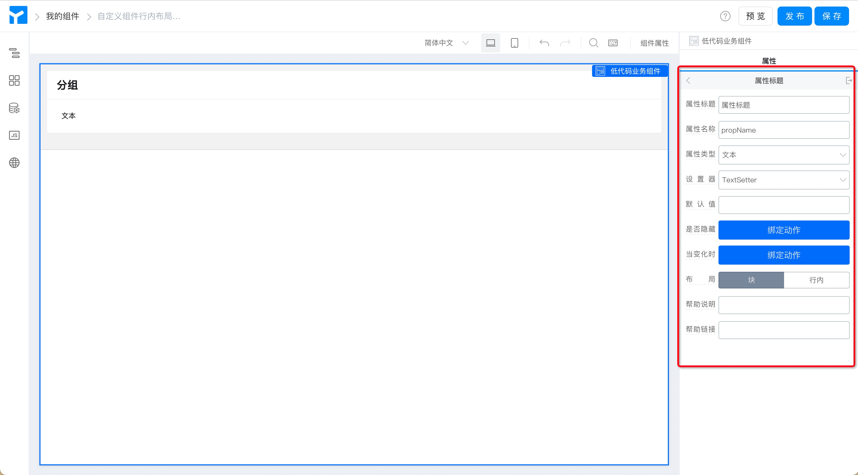
1.1 property title
The name of the attribute configured for the custom component. The default name of the attribute title is "attribute Title". An easy-to-understand title helps users better understand the meaning of the attribute or identify the content to be filled in.
When using this component on the page, the following figure corresponds to the following figure:
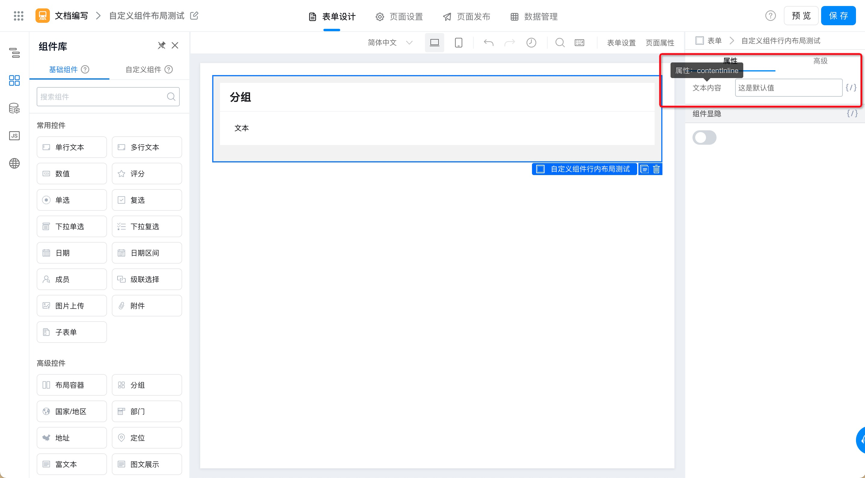
Figure 1.1-4 demonstration of the effect of component properties in the form designer
1.2 attribute name
The attribute name of the component is the attribute Key of the component, similar to props.xxx in the group. The default value is propName. You can bind variables in page design to control components. For example, the attribute value of a custom component is used as the title of a component in the custom component. (As shown in Figure 1.1-5)
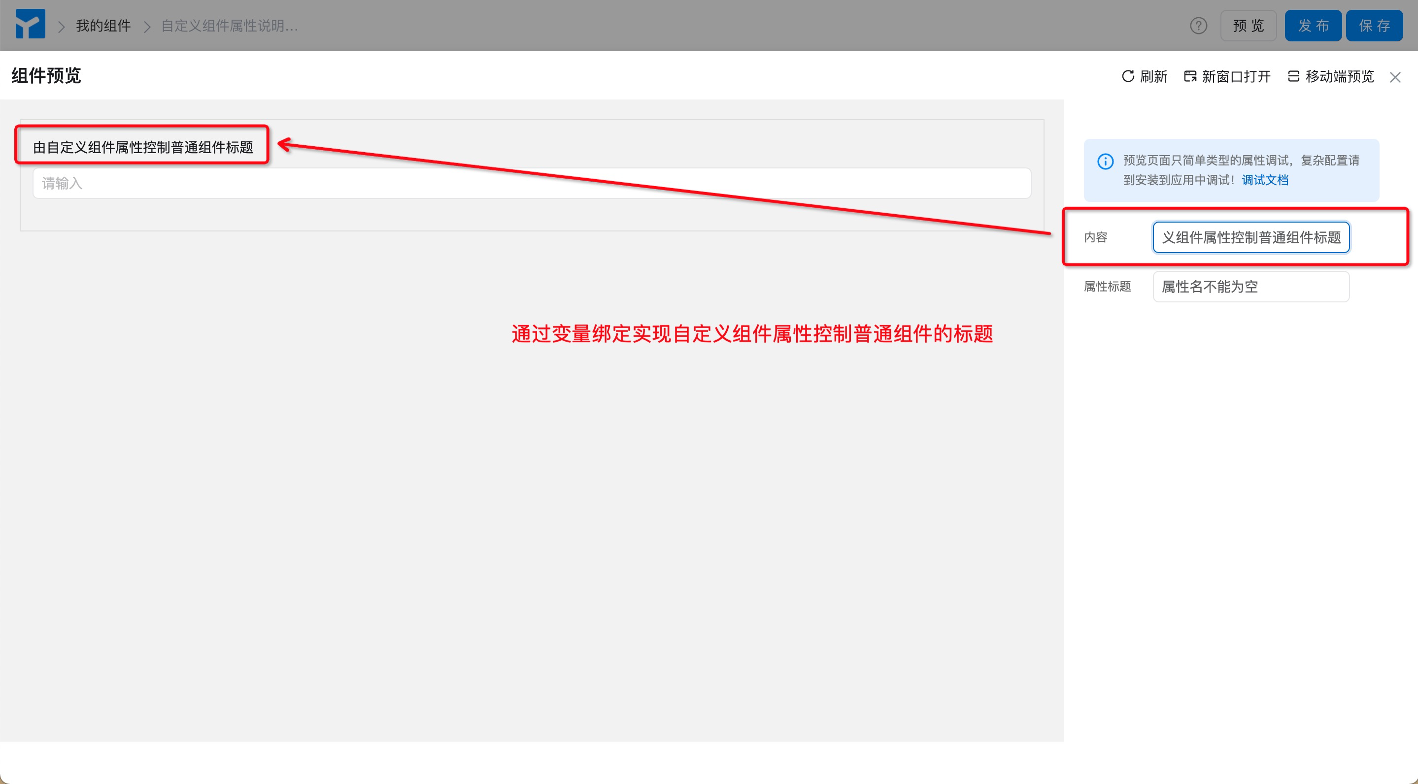
Figure 1.1-5 Use of attribute names
Note: The attribute name of the component cannot be empty, otherwise an error will be reported when calling or assigning operations.
1.3 attribute type
The attribute types of components are basically similar to common data types, including:Text, Boolean, number, object, array, function, elementSeven types, each data type corresponds to severalSetterTo meet the processing needs of different dimensions of data. (As shown in Figure 1.1-6)
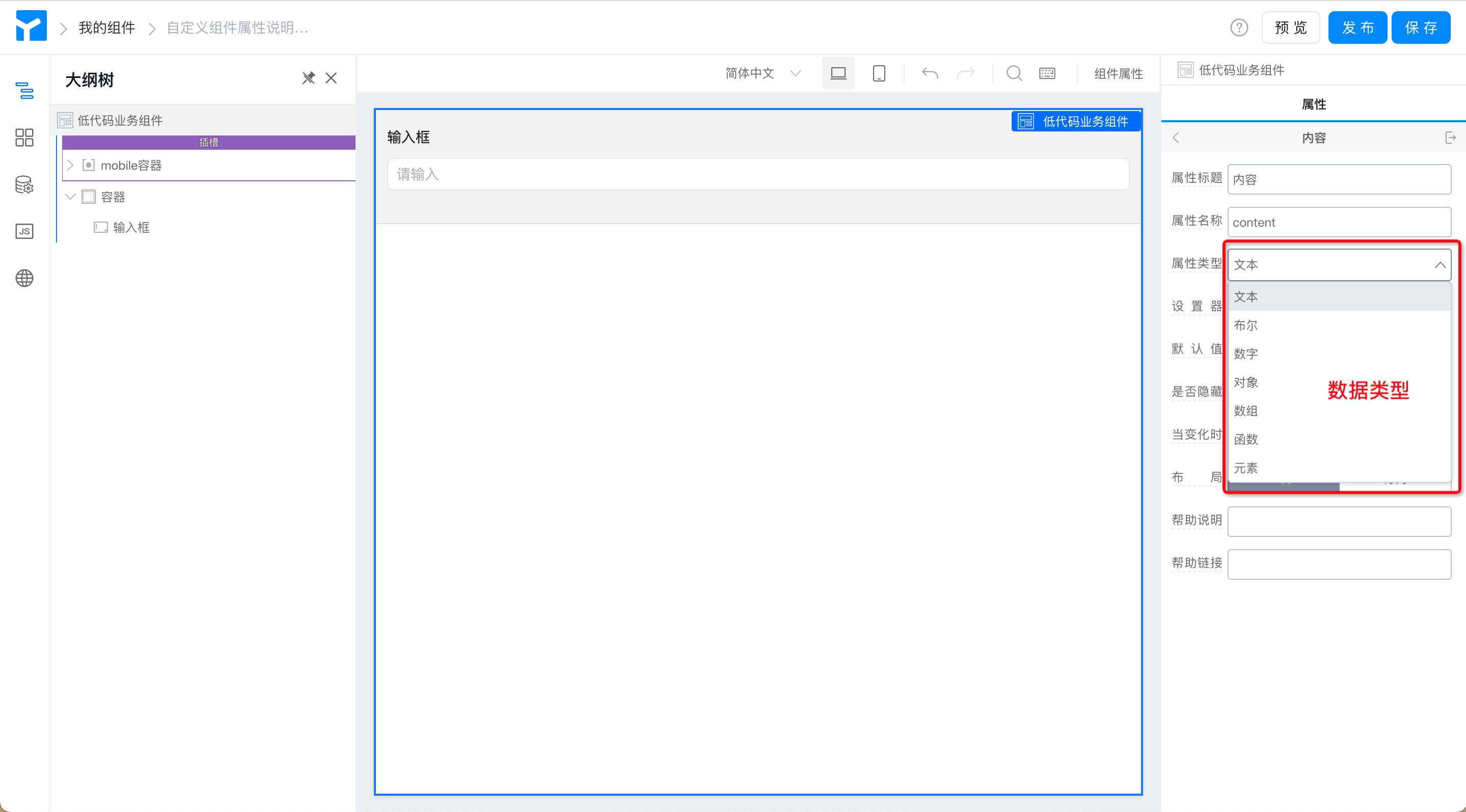
Figure 1.1-6 attribute type definition
1.4 setter
Components of different attribute types have different attribute setters to implement different component rendering and data processing methods. For example, the text type corresponds to five setters. (As shown in Figure 1.1-7)
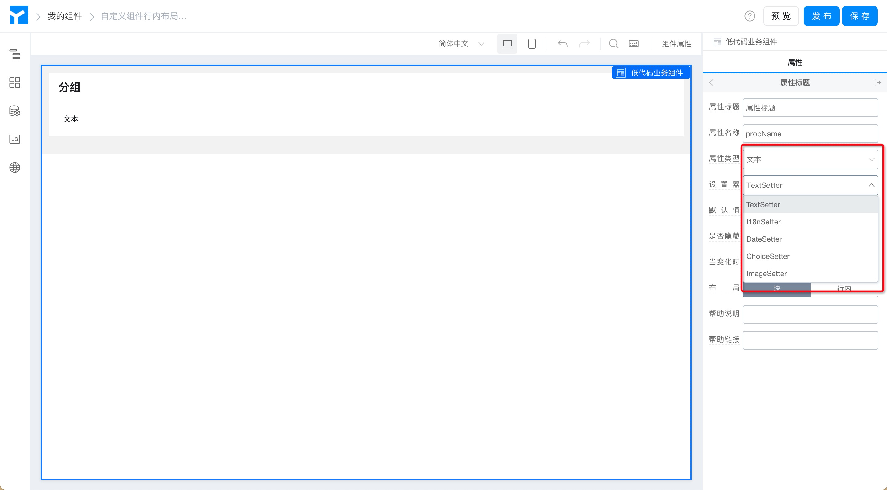
Figure 1.1-7 component property setter
1.5 default value
It refers to the fields displayed by default by custom components in the form when users access the form. (The effect is shown in Figure 1.1-8)
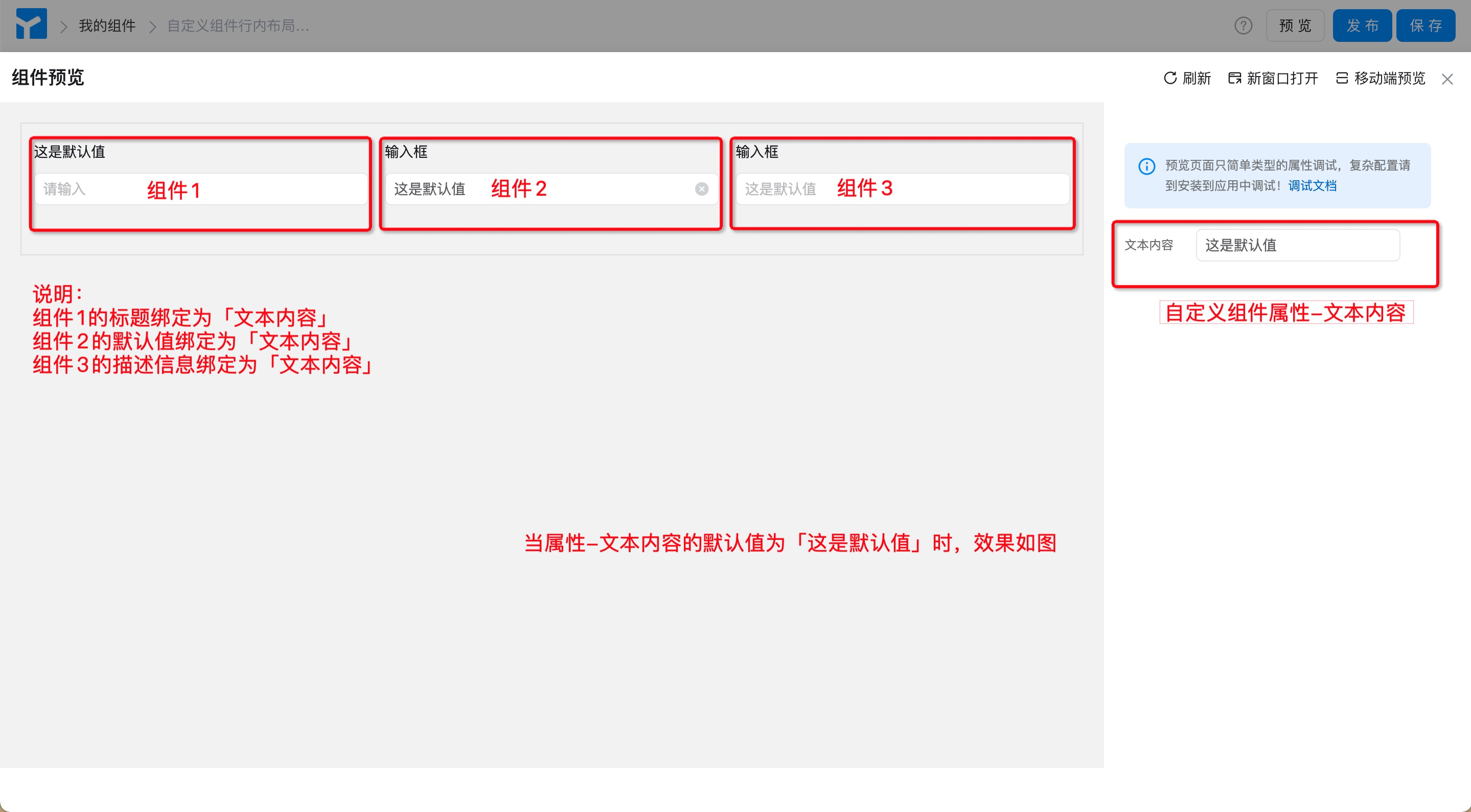
Figure 1.1-8 default value of component properties
1.6 whether variable binding is supported
Variable binding in page design.
1.7 hide or not
It is generally not used to control whether this attribute is hidden.
1.8 when changing
It can be used to link multiple attributes, which is generally not used.
1.9 layout
DividedblockAndinline, used to set the arrangement of this custom component in the page.
1.10 help instructions
- Temporarily unavailable.
1.11 help connect
- Temporarily unavailable.